Checklist
- 1. Test for Basic Tablet App Quality
- 2. Optimize your layouts
- 3. Use the extra screen area
- 4. Use assets designed for tablets
- 5. Adjust fonts and touch targets
- 6. Adjust homescreen widgets
- 7. Offer the app's full feature set
- 8. Target Android versions properly
- 9. Declare dependencies properly
- 10. Declare tablet screens support
- 11. Showcase your tablet UI
- 12. Follow publishing best practices
Testing
Before you publish an app on Google Play, it's important to make sure that the app meets the basic expectations of tablet users through compelling features and an intuitive, well-designed UI.
Tablets are a growing part of the Android installed base that offers new opportunities for user engagement and monetization. If your app is targeting tablet users, this document helps you focus on key aspects of quality, feature set, and UI that can have a significant impact on the app's success. Each focus area is given as checklist item, with each one comprising several smaller tasks or best practices.
Although the checklist tasks below are numbered for convenience, you can handle them in any order and address them to the extent that you feel is right for your app. In the interest of delivering the best possible product to your customers, follow the checklist recommendations to the greatest extent possible.
As you move through the checklist, you'll find links to support resources that can help you address the topics raised in each task.
1. Test for basic tablet app quality
The first step in delivering a great tablet app experience is making sure that it meets the core app quality criteria for all of the devices and form factors that the app is targeting. For complete information, see the Core App Quality Guidelines.
Before publishing, also ensure that your app passes several basic technical checks and launch criteria, such as:
- Targets appropriate Android versions
- Specifies any hardware dependencies properly
- Declares support for appropriate screens
- Uses all of the available screen space
- Screenshots are uploaded to Google Play
If your app is already uploaded to the Google Play Developer Console, you can see how it is doing against these checks by visiting the Optimization Tips page.
2. Optimize your layouts for larger screens
Android makes it easy to develop an app that runs well on a wide range of device screen sizes and form factors. This broad compatibility works in your favor, since it helps you design a single app that you can distribute widely to all of your targeted devices. However, to give your users the best possible experience on each screen configuration — in particular on tablets — you need to optimize your layouts and other UI components for each targeted screen configuration. On tablets, optimizing your UI lets you take full advantage of the additional screen available, such as to offer new features, present new content, or enhance the experience in other ways to deepen user engagement.
If you developed your app for handsets and now want to distribute it to tablets, you can start by making minor adjustments to your layouts, fonts, and spacing. In some cases — such as for 7-inch tablets or for a game with large canvas — these adjustments may be all you need to make your app look great. In other cases, such as for larger tablets, you can redesign parts of your UI to replace "stretched UI" with an efficient multipane UI, easier navigation, and additional content.
Here are some suggestions:
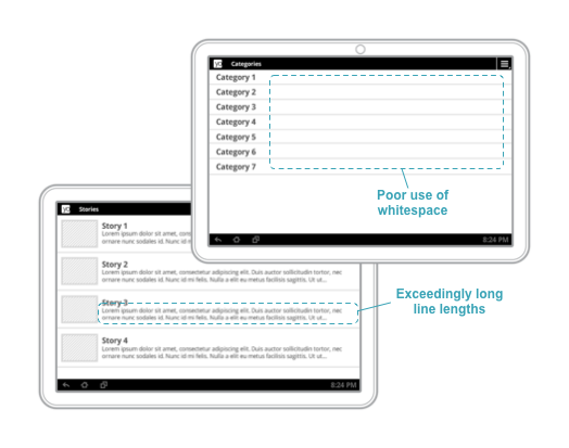
Get rid of "stretched" UI: On tablets, single-pane layouts lead to awkward whitespace and excessive line lengths. Use padding to reduce the width of UI elements and consider using multi-pane layouts.
- Provide custom layouts as needed for
largeandxlargescreens. You can also provide layouts that are loaded based on the screen's shortest dimension or the minimum available width and height. - At a minimum, customize dimensions such as font sizes, margins, spacing for larger screens, to improve use of space and content legibility.
- Adjust positioning of UI controls so that they are easily accessible to users when holding a tablet, such as toward the sides when in landscape orientation.
- Padding of UI elements should normally be larger on tablets than on handsets. A 48dp rhythm (and a 16dp grid) is recommended.
- Adequately pad text content so that it is not aligned directly along screen edges.
Use a minimum
16dppadding around content near screen edges.
In particular, make sure that your layouts do not appear "stretched" across the screen:
- Lines of text should not be excessively long — optimize for a maximum 100 characters per line, with best results between 50 and 75.
- ListViews and menus should not use the full screen width.
- Use padding to manage the widths of onscreen elements or switch to a multi-pane UI for tablets (see next section).
Related resources
- Metrics and Grids—Android Design document that explains how to create layouts based on density-independent grids.
- Devices and Displays—Android Design document that explains how to design a UI that works well on different devices and screen sizes.
- Supporting Multiple Screens—Developer documentation that explains the details of managing UI for best display on multiple screen sizes.
- Configuration examples—Examples of how to declare layouts and other resources for specific screen sizes.
3. Take advantage of extra screen area available on tablets
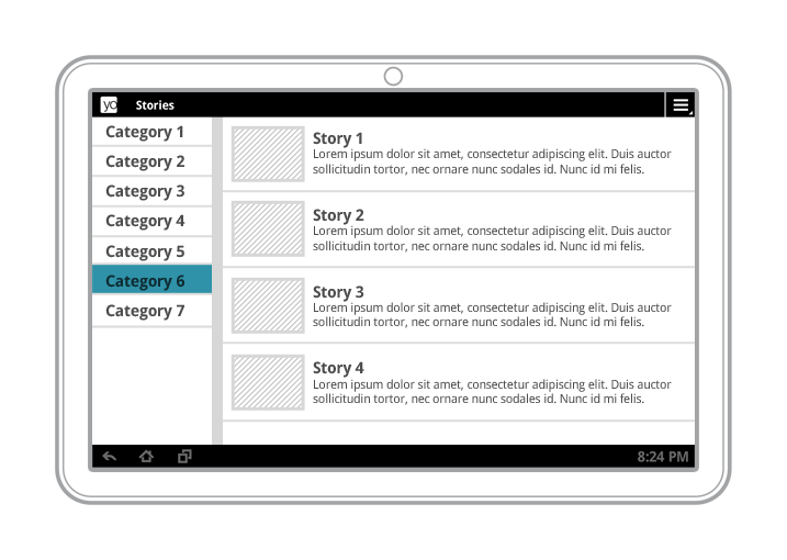
Multi-pane layouts result in a better visual balance on tablet screens, while offering more utility and legibility.
Tablet screens provide significantly more screen real estate to your app, especially when in landscape orientation. In particular, 10-inch tablets offer a greatly expanded area, but even 7-inch tablets give you more space for displaying content and engaging users.
As you consider the UI of your app when running on tablets, make sure that it is taking full advantage of extra screen area available on tablets. Here are some suggestions:
- Look for opportunities to include additional content or use an alternative treatment of existing content.
- Use multi-pane layouts on tablet screens to combine single views into a compound view. This lets you use the additional screen area more efficiently and makes it easier for users to navigate your app.
- Plan how you want the panels of your compound views to reorganize when screen orientation changes.
- While a single screen is implemented as an
Activitysubclass, consider implementing individual content panels asFragmentsubclasses. This lets you maximize code reuse across different form factors and across screens that share content. - Decide on which screen sizes you'll use a multi-pane UI, then provide the
different layouts in the appropriate screen size buckets (such as
large/xlarge) or minimum screen widths (such assw600dp/sw720).
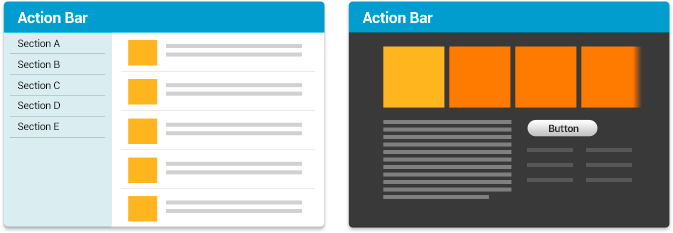
Compound views combine several single views from a handset UI (above) into a richer, more efficient UI for tablets (below).
Related resources
- Multi-pane Layouts—Android Design guide for using multi-pane UI, including examples of how to flatten navigation and integrate more content into your tablet UI.
- Planning for Multiple Touchscreen Sizes—Android Training class that walks you through the essentials of planning an intuitive, effective navigation for tablets and other devices.
- Designing for Multiple Screens—Android Training class that walks you through the essentials of planning an intuitive, effective navigation for tablets and other devices.
4. Use Icons and other assets that are designed for tablet screens
To ensure your app looks its best, provide icons and other bitmap assets for each density in the range commonly supported by tablets. Specifically, you should design your icons for the action bar, notifications, and launcher according to the Iconography guidelines and provide them in multiple densities, so they appear at the appropriate size on all screens without blurring or other scaling artifacts.
Table 1. Raw asset sizes for icon types.
| Density | Launcher | Action Bar | Small/Contextual | Notification |
|---|---|---|---|---|
mdpi |
48x48 px | 32x32 px | 16x16 px | 24x24 px |
hdpi |
72x72 px | 48x48 px | 24x24 px | 36x36 px |
tvdpi |
(use hdpi) | (use hdpi) | (use hdpi) | (use hdpi) |
xhdpi |
96x96 px | 64x64 px | 32x32 px | 48x48 px |
xxhdpi |
144x144 px | 96x96 px | 48x48 px | 72x72 px |
Your app should supply a version of each icon and bitmap asset that's optimized for at least one the following common tablet screen densities:
hdpixhdpixxhdpi
Other tips:
- When possible, use vector shapes for your icon designs so you can scale them without loss of detail and edge crispness.
- Use density-specific resource qualifiers to ensure that the proper icons are loaded for each screen density.
- Tablets and other large screen devices often request a launcher icon that is one density
size larger than the device's actual density, so you should provide your launcher
icon at the highest density possible. For example, if a tablet has an
xhdpiscreen, it will request thexxhdpiversion of the launcher icon.
Related resources
- Iconography— Design guidelines and tips about how to create various types of icons.
- Providing Resources—Developer documentation on how to provide sets of layouts and drawable resources for specific ranges of device screens.
- Supporting Multiple Screens—API Guide documentation that explains the details of managing UI for best display on multiple screen sizes.
- Supporting Different Screens—Android Training class that takes you through the process of optimizing the user experience for different screen sizes and densities.
5. Adjust font sizes and touch targets for tablet screens
To make sure your app is easy to use on tablets, take some time to adjust the font sizes and touch targets in your tablet UI, for all of the screen configurations you are targeting. You can adjust font sizes through styleable attributes or dimension resources, and you can adjust touch targets through layouts and bitmap drawables, as discussed above.
Here are some considerations:
- Text should not be excessively large or small on tablet screen sizes and densities. Make sure that labels are sized appropriately for the UI elements they correspond to, and ensure that there are no improper line breaks in labels, titles, and other elements.
- The recommended touch-target size for onscreen elements is 48dp (32dp minimum) — some adjustments may be needed in your tablet UI. Read Metrics and Grids to learn about implementation strategies to help most of your users. To meet the accessibility needs of certain users, it may be appropriate to use larger touch targets.
- When possible, for smaller icons, expand the touchable area to more than
48dp using
TouchDelegateor just centering the icon within the transparent button.
Related resources
- Metrics and Grids —Android Design document that explains how to arrange and size touch targets and other UI elements on the screen.
- Typography—Android Design document that gives an overview of how to use typography in your apps.
- Supporting Multiple Screens—Developer documentation that explains the details of managing UI for best display on multiple screen sizes.
- Supporting Different Densities—Android Training class that shows you how to provide sets of layouts and drawable resources for specific ranges of device screens.
6. Adjust sizes of home screen widgets for tablet screens
If your app includes a home screen widget, here are a few points to consider to ensure a great user experience on tablet screens:
- Make sure that the widget's default height and width are set appropriately for tablet screens, as well as the minimum and maximum resize height and width.
- The widget should be resizable to 420dp or more, to span 5 or more home screen rows (if this is a vertical or square widget) or columns (if this is a horizontal or square widget).
- Make sure that 9-patch images render correctly.
- Use default system margins.
- Set the app's
targetSdkVersionto 14 or higher, if possible.
Related resources
- Adding the AppWidgetProviderInfo Metadata —API Guide that explains how to set the height and width dimensions of a widget.
- App Widget Design Guidelines—API Guide that provides best practices and techniques for designing and managing the size of widgets.
7. Offer the app's full feature set to tablet users
Let your tablet users experience the best features of your app. Here are some recommendations:
- Design your app to offer at least the same set of features on tablets as it does on handsets.
- In exceptional cases, your app might omit or replace certain features on
tablets if they are not supported by the hardware or use-case of most tablets.
For example:
- If the handset uses telephony features but telephony is not available on the current tablet, you can omit or replace the related functionality.
- Many tablets have a GPS sensor, but most users would not normally carry their tablets while running. If your phone app provides functionality to let the user record a GPS track of their runs while carrying their phones, the app would not need to provide that functionality on tablets because the use-case is not compelling.
- If you will omit a feature or capability from your tablet UI, make sure that it is not accessible to users or that it offers “graceful degradation” to a replacement feature (also see the section below on hardware features).
8. Target Android versions properly
To ensure the broadest possible distribution to tablets, make sure that your app properly targets the Android versions that support tablets. Initial support for tablets was added in Android 3.0 (API level 11). Unified UI framework support for tablets, phones, and other devices was introduced in Android 4.0 (API level 14) and is supported in later versions.
You can set the app's
range of targeted Android versions in the manifest file, in the
<uses-sdk> element. In most cases, you can target Android versions properly by setting the element's targetSdkVersion attribute to the highest API level available.
At a minimum, check the <uses-sdk>
element to make sure that:
targetSdkVersionis declared with value 11 or higher (14 or higher is recommended), ORminSdkVersionis declared with value 11 or higher.- If a
maxSdkVersionattribute is declared, it must have a value of 11 or higher. Note that, in general, the use ofmaxSdkVersionis not recommended.
Related resources
- Android API Levels—Introduces API levels and how they relate to compatibility. A reference of available API levels is included.
- Supporting Different Platform Versions—Training class showing how to declare support for minimum and target API levels in your app.
9. Declare hardware feature dependencies properly
Handsets and tablets typically offer slightly different hardware support for sensors, camera, telephony, and other features. For example, many tablets are available in a "Wi-Fi" configuration that does not include telephony support.
So that you can distribute a single APK broadly across your full customer base of phones and tablets, make sure that your app doesn't declare requirements for hardware features that aren't commonly available on tablets. Instead, properly declare the hardware features as not required in the app manifest, as described below.
- In your app manifest, locate any
<uses-feature>elements. In particular, look for hardware features that might not be available on some tablets, such as:android.hardware.telephonyandroid.hardware.camera(refers to back camera), orandroid.hardware.camera.front
- Declare the
<uses-feature>elements as not required by including theandroid:required=”false”attribute.For example, here's the proper way to declare a dependency on
android.hardware.telephony, such that you can still distribute the app broadly, even to devices that don't offer telephony:<uses-feature android:name="android.hardware.telephony" android:required="false" />
- Similarly, check the manifest for
<permission>elements that imply hardware feature requirements that not be appropriate for tablets. If you find such permissions, make sure to explicitly declare a corresponding<uses-feature>element for the features and includes theandroid:required=”false”attribute.
After declaring hardware features as not required, make sure to test your app on a variety of devices. The app should function normally when the hardware features it uses are not available, and it should offer "graceful degradation" and alternative functionality where appropriate.
For example, if an app normally uses GPS to set the location but GPS is not supported on the device, the app could let the user set the location manually instead. The app can check for device hardware capabilities at runtime and handle as needed.
Related resources
- Permissions that Imply Feature Requirements—A list of permissions that may cause unwanted filtering if declared in your app's manifest.
-
<uses-feature>—Description and reference documentation for the<uses-feature>manifest element. - Testing the features required by your application—Description of how to determine the actual set of hardware and software requirements (explicit or implied) that your app requires.
10. Declare support for tablet screens
To ensure that you can distribute your app to a broad range of tablets, your app should declare support for tablet screen sizes in its manifest file, as follows:
- A
<supports-screens>element, if declared, must not specifyandroid:largeScreens="false"orandroid:xlargeScreens="false". - For apps targeting
minSdkVersionvalue less than 13, a<supports-screens>element must be declared with bothandroid:largeScreens="true"andandroid:xlargeScreens="true".
If the app declares a
<compatible-screens>
element in the manifest, the element should include attributes that specify
all of the size and density combinations for tablet screens that the
app supports. Note that, if possible, you should avoid using the
<compatible-screens>
element in your app.
Related resources
- Declaring Screen Size Support—Developer documentation that explains the details of managing UI for best display on multiple screen sizes.
11. Showcase your tablet UI in Google Play
After you've done the work to create an rich, optimized UI for your tablet app, make sure that you let your customers know about it! Here are some key ways to promote your tablet app to users on Google Play.
Upload screenshots of your tablet UI
Tablet users want to know what your app is like on a tablet device, not on a phone. If you developed a tablet app, make sure to upload screenshots of your tablet UI to the Google Play Developer Console. Here are some guidelines:
- Your screenshots should show the core functionality of your app, not a startup or sign-in page. Wherever users will spend most of their time, that's what you should show in your screenshots.
- Add screenshots taken on both 7-inch and 10-inch tablets.
- It's recommended that you add screenshots taken in both landscape and portrait orientations, if possible.
- Use screen captures if possible. Avoid showing actual device hardware in your screenshots.
- The recommended resolution of your tablet screenshots is 1280 x 720 or higher in each orientation.
- You can upload as many as 8 screenshots of your tablet UI for 7-inch tablets and an additional 8 for 10-inch tablets.
Update your app description and release notes
- In your app description, make sure to highlight that your app offers tablet-optimized UI and great features for tablet users. Consider adding some detail about how your tablet UI works and why users will like it.
- Include information about tablet support in the app's release notes and update information.
Update your promotional video
Many users view an app's promotional video to get an idea of what the app is like and whether they'll enjoy it. For tablet users, capitalize on this interest by highlighting your app's tablet UI in your promotional video. Here are some tips and guidelines:
- Add one or more shots of your app running on a tablet. To engage with tablet users most effectively, it's recommended that you promote your tablet UI in approximately equal proportion to your phone UI.
- Show your tablet UI as early as possible in the video. Don't assume that tablet users will wait patiently through a feature walkthrough on a phone UI. Ideally, you should engage them immediately by showing the tablet UI within the first 10 seconds, or at the same point that you introduce the phone UI.
- To make it clear that you are showing a tablet UI, include shots of your app running on a hand-held tablet device.
- Highlight your app's tablet UI in the video's narrative or voiceover.
Feature your tablet UI in your promotional campaigns
Make sure to let tablet users know about your tablet UI in your promotional campaigns, web site, social posts, advertisements, and elsewhere. Here are some suggestions:
- Plan a marketing or advertising campaign that highlights the use of your app on tablets.
- Show your tablet app at its best in your promotional campaigns—use the Device Art Generator to quickly generate a high-quality promotional image of your app running on a 7-inch or 10-inch tablet, in the orientation of your choice, with or without drop-shadow and screen glare. It's as simple as capture, drag, and drop.
- Include a Google Play badge in your online promotions to let users link directly to your app's store listing. You can generate a badge in a variety of languages using the Badge Generator.
Related resources
- Publishing Checklist —Recommendations on how to prepare your app for publishing, test it, and launch successfully on Google Play.
- Google Play Developer Console—The tools console for publishing your app to Android users.
- Google Play Badge Generator—Create "Get it on Google Play" badges for your app in a variety of languages with a single click.
- Device Art Generator—Drag and drop tool that lets you instantly create production- ready art showing your app running on a tablet device.
12. Follow best practices for publishing in Google Play
Here are some best practices for delivering a successful tablet app on Google Play.
Check out your app's Optimization Tips
The Google Play Developer Console now offers an Optimization Tips page that lets you quickly check how your app is doing against basic guidelines for tablet app distribution and quality. To visit the page, sign into the Developer Console, load the app from All Applications, and click Optimization Tips in the left navigation.
How to send feedback
Please use the link below to send feedback or request a manual review of your Optimization Tips.
Make sure to read the relevant sections of the Tablet App Quality Guidelines prior to sending feedback.
The Developer Console creates your app's Optimization Tips page by running a series of checks to verify basic quality criteria. If it finds any issues, it alerts you to them as "To Do" items in the Optimization Tips page.
If you've developed a tablet experience for your app, make sure to visit the Optimization Tips page to see how your app is doing against the basic checks. If there are any issues listed, we recommend addressing them in your app and uploading a new binary for distribution, if needed.
If the Optimization Tips page lists "To Do" issues that you feel don't apply to your app or affect its quality on tablets, please notify us using the Designed for Tablets Contact Form ». We will review your app and update your Optimization Tips page as appropriate.
Confirm the app's filtering
After you've uploaded the app to the Developer Console, check the APK's Supported Devices list to make sure that the app is not filtered from tablet devices that you want to target.
Distribute as a single APK
It's recommended that you publish your app as a single APK for all screen sizes (phones and tablets), with a single Google Play listing. This approach has several important advantages.
- Easier for users to find your app from search, browsing, or promotions
- Easier for users to restore your app automatically if they get a new device.
- Your ratings and download stats are consolidated across all devices.
- Publishing a tablet app in a second listing can dilute ratings for your brand.
If necessary, you can alternatively choose to deliver your app using Multiple APK Support, although in most cases using a single APK to reach all devices is strongly recommended.
Related resources
- Publishing Checklist— Recommendations on how to prepare your app for publishing, test it, and launch successfully on Google Play.
- Google Play Developer Console—The tools console for publishing your app to Android users.
Setting Up a Test Environment for Tablets
To assess the quality of your app on tablets — both for core app quality and tablet app quality — you need to set up a suitable hardware or emulator environment for testing.
The ideal test environment would include a small number of actual hardware devices that represent key form factors and hardware/software combinations currently available to consumers. It's not necessary to test on every device that's on the market — rather, you should focus on a small number of representative devices, even using one or two devices per form factor. The table below provides an overview of devices you could use for testing.
If you are not able to obtain actual hardware devices for testing, you should set up emulated devices (AVDs) to represent the most common form factors and hardware/software combinations. See the table below for suggestions on the emulator configurations to use.
To go beyond basic testing, you can add more devices, more form factors, or new hardware/software combinations to your test environment. For example, you could include mid-size tablets, tablets with more or fewer hardware/software features, and so on. You can also increase the number or complexity of tests and quality criteria.
Table 1. A typical tablet test environment might include one or two devices from each row in the table below, with one of the listed platform versions, screen configurations, and hardware feature configurations.
| Type | Size | Density | Version | AVD Skin |
|---|---|---|---|---|
| 7-inch tablet | large or-sw600 |
hdpi,tvdpi |
Android 4.0+ (API level 14 and higher) | WXGA800-7in |
| 10-inch tablet | xlarge or-sw800 |
mdpi,hdpi,xhdpi |
Android 3.2+ (API level 13 and higher) | WXGA800 |