Design Guide
Action Bar
The action bar is a window feature that identifies the user location, and provides user actions and navigation modes. Using the action bar offers your users a familiar interface across applications that the system gracefully adapts for different screen configurations.
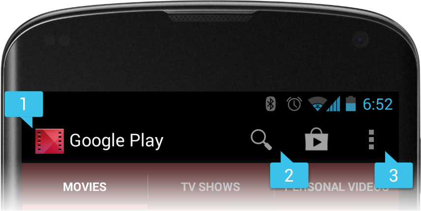
Figure 1. An action bar that includes the [1] app icon, [2] two action items, and [3] action overflow.
The action bar provides several key functions:
- Provides a dedicated space for giving your app an identity and indicating the user's location in the app.
- Makes important actions prominent and accessible in a predictable way (such as Search).
- Supports consistent navigation and view switching within apps (with tabs or drop-down lists).
For more information about the action bar's interaction patterns and design guidelines, see the Action Bar design guide.
The ActionBar APIs were first added in Android 3.0 (API level 11) but they
are also available in the Support Library
for compatibility with Android 2.1 (API level 7) and above.
This guide focuses on how to use the
support library's action bar, but if your app supports only Android 3.0 or higher, you
should use the ActionBar APIs in the framework. Most of the APIs are
the same—but reside in a different package namespace—with a few exceptions to method
names or signatures that are noted in the sections below.
Caution: Be certain you import
the ActionBar class (and related APIs) from the appropriate package:
- If supporting API levels lower than 11:
import android.support.v7.app.ActionBar - If supporting only API level 11 and higher:
import android.app.ActionBar
Note: If you're looking for information about the contextual action bar for displaying contextual action items, see the Menu guide.
Adding the Action Bar
As mentioned above, this guide focuses on how to use the ActionBar APIs in the support library. So before you can add the action
bar, you must set up your project with the appcompat v7 support library by
following the instructions in the Support
Library Setup.
Once your project is set up with the support library, here's how to add the action bar:
- Create your activity by extending
ActionBarActivity. - Use (or extend) one of the
Theme.AppCompatthemes for your activity. For example:<activity android:theme="@style/Theme.AppCompat.Light" ... >
Now your activity includes the action bar when running on Android 2.1 (API level 7) or higher.
On API level 11 or higher
The action bar is included in all activities that use the
Theme.Holo theme (or one of its
descendants), which is the default theme when either the targetSdkVersion or
minSdkVersion
attribute is set to "11" or higher. If you don't want the action bar for an
activity, set the activity theme to Theme.Holo.NoActionBar.
Removing the action bar
You can hide the action bar at runtime by calling hide().
For example:
ActionBar actionBar = getSupportActionBar();
actionBar.hide();
On API level 11 or higher
Get the ActionBar with the getActionBar()
method.
When the action bar hides, the system adjusts your layout to fill the
screen space now available. You can bring the action bar back by calling show().
Beware that hiding and removing the action bar causes your activity to re-layout in order to
account for the space consumed by the action bar. If your activity often hides and shows the
action bar, you might want to enable overlay mode. Overlay mode
draws the action bar in front of your activity layout, obscuring the top portion. This
way, your layout remains fixed when the action bar hides and re-appears. To enable overlay mode,
create a custom theme for your activity and set windowActionBarOverlay to true. For more information, see the section below about Styling the Action Bar.
Using a logo instead of an icon
By default, the system uses your application icon in the action bar, as specified by the icon
attribute in the <application> or <activity> element. However, if you also specify the logo
attribute, then the action bar uses the logo image instead of the icon.
A logo should usually be wider than the icon, but should not include unnecessary text. You should generally use a logo only when it represents your brand in a traditional format that users recognize. A good example is the YouTube app's logo—the logo represents the expected user brand, whereas the app's icon is a modified version that conforms to the square requirement for the launcher icon.
Adding Action Items
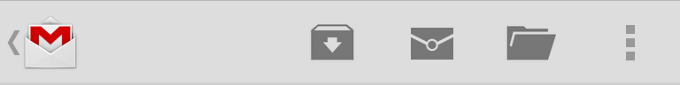
Figure 2. Action bar with three action buttons and the overflow button.
The action bar provides users access to the most important action items relating to the app's current context. Those that appear directly in the action bar with an icon and/or text are known as action buttons. Actions that can't fit in the action bar or aren't important enough are hidden in the action overflow. The user can reveal a list of the other actions by pressing the overflow button on the right side (or the device Menu button, if available).
When your activity starts, the system populates the action items by calling your activity's
onCreateOptionsMenu() method. Use this
method to inflate a menu resource that defines all the
action items. For example, here's a menu resource defining a couple of menu items:
res/menu/main_activity_actions.xml
<menu xmlns:android="http://schemas.android.com/apk/res/android" >
    <item android:id="@+id/action_search"
          android:icon="@drawable/ic_action_search"
          android:title="@string/action_search"/>
    <item android:id="@+id/action_compose"
          android:icon="@drawable/ic_action_compose"
          android:title="@string/action_compose" />
</menu>
Then in your activity's onCreateOptionsMenu()
method, inflate the menu resource into the given Menu
to add each item to the action bar:
@Override
public boolean onCreateOptionsMenu(Menu menu) {
    // Inflate the menu items for use in the action bar
    MenuInflater inflater = getMenuInflater();
    inflater.inflate(R.menu.main_activity_actions, menu);
    return super.onCreateOptionsMenu(menu);
}
To request that an item appear directly in the action bar
as an action button, include showAsAction="ifRoom" in the <item> tag. For example:
<menu xmlns:android="http://schemas.android.com/apk/res/android"
      xmlns:yourapp="http://schemas.android.com/apk/res-auto" >
    <item android:id="@+id/action_search"
          android:icon="@drawable/ic_action_search"
          android:title="@string/action_search"
          yourapp:showAsAction="ifRoom"  />
    ...
</menu>
If there's not enough room for the item in the action bar, it will appear in the action overflow.
Using XML attributes from the support library
Notice that theshowAsAction attribute above uses a custom namespace defined in the
<menu> tag. This is necessary when using any XML attributes defined by the support
library, because these attributes do not exist in the Android framework on older devices.
So you must use your own namespace as a prefix for all attributes defined by the support library.
If your menu item supplies both a title and an icon—with the title and
icon attributes—then the action item shows only the icon by default. If you
want to display the text title, add "withText" to the showAsAction
attribute. For example:
<item yourapp:showAsAction="ifRoom|withText" ... />
Note: The "withText" value is a hint to the
action bar that the text title should appear. The action bar will show the title when possible, but
might not if an icon is available and the action bar is constrained for space.
You should always define the title for each item even if you don't declare that
the title appear with the action item, for the following reasons:
- If there's not enough room in the action bar for the action item, the menu item appears in the overflow where only the title appears.
- Screen readers for sight-impaired users read the menu item's title.
- If the action item appears with only the icon, a user can long-press the item to reveal a tool-tip that displays the action title.
The icon is optional, but recommended. For icon design recommendations,
see the Iconography design
guide. You can also download a set of standard action bar icons (such as for Search or Discard)
from the Downloads page.
You can also use "always" to declare that an item always appear as an action button.
However, you should not force an item to appear in the action bar this
way. Doing so can create layout problems on devices with a narrow screen. It's best to instead
use "ifRoom" to request that an item appear in the action bar, but allow the system to move
it into the overflow when there's not enough room. However, it might be necessary to use this value
if the item includes an action view that cannot be collapsed and
must always be visible to provide access to a critical feature.
Handling clicks on action items
When the user presses an action, the system calls your activity's onOptionsItemSelected() method. Using the
MenuItem passed to this method, you can identify the action by calling getItemId(). This returns the unique ID provided by the <item>
tag's id attribute so you can perform the appropriate action. For example:
@Override
public boolean onOptionsItemSelected(MenuItem item) {
    // Handle presses on the action bar items
    switch (item.getItemId()) {
        case R.id.action_search:
            openSearch();
            return true;
        case R.id.action_compose:
            composeMessage();
            return true;
        default:
            return super.onOptionsItemSelected(item);
    }
}
Note: If you inflate menu items from a fragment, via the Fragment class's onCreateOptionsMenu()
callback, the system calls onOptionsItemSelected() for that
fragment when the user selects one of those items. However, the activity gets a chance to
handle the event first, so the system first calls onOptionsItemSelected() on the activity,
before calling the same callback for the fragment. To ensure that any fragments in the
activity also have a chance to handle the callback, always pass the call to the superclass
as the default behavior instead of returning false when you do not handle the item.
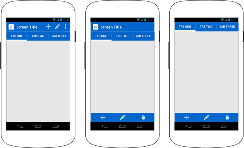
Figure 3. Mock-ups showing an action bar with tabs (left), then with split action bar (middle); and with the app icon and title disabled (right).
Using split action bar
Split action bar provides a separate bar at the bottom of the screen to display all action items when the activity is running on a narrow screen (such as a portrait-oriented handset).
Separating the action items this way ensures that a reasonable amount of space is available to display all your action items on a narrow screen, while leaving room for navigation and title elements at the top.
To enable split action bar when using the support library, you must do two things:
- Add
uiOptions="splitActionBarWhenNarrow"to each<activity>element or to the<application>element. This attribute is understood only by API level 14 and higher (it is ignored by older versions). - To support older versions, add a
<meta-data>element as a child of each<activity>element that declares the same value for"android.support.UI_OPTIONS".
For example:
<manifest ...>
    <activity uiOptions="splitActionBarWhenNarrow" ... >
        <meta-data android:name="android.support.UI_OPTIONS"
                   android:value="splitActionBarWhenNarrow" />
    </activity>
</manifest>
Using split action bar also allows navigation tabs to collapse into the
main action bar if you remove the icon and title (as shown on the right in figure 3).
To create this effect, disable the action bar
icon and title with setDisplayShowHomeEnabled(false) and setDisplayShowTitleEnabled(false).
Navigating Up with the App Icon
Design Guide
Navigation with Back and Up

Figure 4. The Up button in Gmail.
Enabling the app icon as an Up button allows the user to navigate your app based on the hierarchical relationships between screens. For instance, if screen A displays a list of items, and selecting an item leads to screen B, then screen B should include the Up button, which returns to screen A.
Note: Up navigation is distinct from the back navigation provided by the system Back button. The Back button is used to navigate in reverse chronological order through the history of screens the user has recently worked with. It is generally based on the temporal relationships between screens, rather than the app's hierarchy structure (which is the basis for up navigation).
To enable the app icon as an Up button, call setDisplayHomeAsUpEnabled().
For example:
@Override
protected void onCreate(Bundle savedInstanceState) {
    super.onCreate(savedInstanceState);
    setContentView(R.layout.activity_details);

    ActionBar actionBar = getSupportActionBar();
    actionBar.setDisplayHomeAsUpEnabled(true);
    ...
}
Now the icon in the action bar appears with the Up caret (as shown in figure 4). However, it won't do anything by default. To specify the activity to open when the user presses Up button, you have two options:
- Specify the parent activity in the manifest file.
This is the best option when the parent activity is always the same. By declaring in the manifest which activity is the parent, the action bar automatically performs the correct action when the user presses the Up button.
Beginning in Android 4.1 (API level 16), you can declare the parent with the
parentActivityNameattribute in the<activity>element.To support older devices with the support library, also include a
<meta-data>element that specifies the parent activity as the value forandroid.support.PARENT_ACTIVITY. For example:<application ... > ... <!-- The main/home activity (has no parent activity) --> <activity android:name="com.example.myfirstapp.MainActivity" ...> ... </activity> <!-- A child of the main activity --> <activity android:name="com.example.myfirstapp.DisplayMessageActivity" android:label="@string/title_activity_display_message" android:parentActivityName="com.example.myfirstapp.MainActivity" > <!-- Parent activity meta-data to support API level 7+ --> <meta-data android:name="android.support.PARENT_ACTIVITY" android:value="com.example.myfirstapp.MainActivity" /> </activity> </application>Once the parent activity is specified in the manifest like this and you enable the Up button with
setDisplayHomeAsUpEnabled(), your work is done and the action bar properly navigates up. - Or, override
getSupportParentActivityIntent()andonCreateSupportNavigateUpTaskStack()in your activity.
This is appropriate when the parent activity may be different depending on how the user arrived at the current screen. That is, if there are many paths that the user could have taken to reach the current screen, the Up button should navigate backward along the path the user actually followed to get there.
The system calls getSupportParentActivityIntent() when the user presses
the Up button while navigating your app (within your app's own task). If the activity that
should open upon up navigation differs depending on how the user arrived at the current location,
then you should override this method to return the Intent that starts the appropriate parent activity.
The system calls onCreateSupportNavigateUpTaskStack() for your activity when the user presses the Up
button while your activity is running in a task that does not belong to your app. Thus,
you must use the TaskStackBuilder passed to this method to construct
the appropriate back stack that should be synthesized when the user navigates up.
Even if you override getSupportParentActivityIntent() to specify up navigation
as the user navigates your app, you can avoid the need to implement onCreateSupportNavigateUpTaskStack() by declaring "default" parent activities in the manifest file
as shown above. Then the default implementation of onCreateSupportNavigateUpTaskStack() will synthesize a back stack based on the parent activities
declared in the manifest.
Note:
If you've built your app hierarchy using a series of fragments instead of multiple
activities, then neither of the above options will work. Instead, to navigate up through your
fragments, override onSupportNavigateUp()
to perform the appropriate fragment transaction—usually by popping
the current fragment from the back stack by calling popBackStack().
For more information about implementing Up navigation, read Providing Up Navigation.
Adding an Action View

Figure 5. An action bar with a collapsible
SearchView.
An action view is a widget that appears in the action bar as a substitute for an action
button. An action view provides fast access to rich actions without changing activities or
fragments, and without replacing the action bar. For example, if you have an action for Search, you
can add an action view to
embeds a SearchView widget in the action bar, as shown in figure
5.
To declare an action view, use either the actionLayout or actionViewClass attribute to specify either a layout
resource or widget class to use, respectively. For example, here's how to add
the SearchView widget:
<?xml version="1.0" encoding="utf-8"?>
<menu xmlns:android="http://schemas.android.com/apk/res/android"
      xmlns:yourapp="http://schemas.android.com/apk/res-auto" >
    <item android:id="@+id/action_search"
          android:title="@string/action_search"
          android:icon="@drawable/ic_action_search"
          yourapp:showAsAction="ifRoom|collapseActionView"
          yourapp:actionViewClass="android.support.v7.widget.SearchView" />
</menu>
Notice that the showAsAction attribute also includes the "collapseActionView"
value. This is optional and declares that the action view should be collapsed into a
button. (This behavior is explained further in the following section about
Handling collapsible action views.)
If you need to configure the action view (such as to add event listeners), you can do so during
the onCreateOptionsMenu() callback. You can
acquire the action view object by calling the static method MenuItemCompat.getActionView() and passing it
the corresponding MenuItem. For example, the search widget from the above
sample is acquired like this:
@Override
public boolean onCreateOptionsMenu(Menu menu) {
    getMenuInflater().inflate(R.menu.main_activity_actions, menu);
    MenuItem searchItem = menu.findItem(R.id.action_search);
    SearchView searchView = (SearchView) MenuItemCompat.getActionView(searchItem);
    // Configure the search info and add any event listeners
    ...
    return super.onCreateOptionsMenu(menu);
}
On API level 11 or higher
Get the action view by calling getActionView() on the
corresponding MenuItem:
menu.findItem(R.id.action_search).getActionView()
For more information about using the search widget, see Creating a Search Interface.
Handling collapsible action views
To preserve the action bar space, you can collapse your action view into an action button.
When collapsed, the system might place the action
into the action overflow, but the
action view still appears in the action bar when the user selects it. You can make your action
view collapsible by adding "collapseActionView" to the showAsAction
attribute, as shown in the XML above.
Because the system expands the action view when the user selects the action, you
do not need to respond to the item in the onOptionsItemSelected() callback. The system still calls
onOptionsItemSelected(), but if
you return true (indicating you've handled the event instead), then the
action view will not expand.
The system also collapses your action view when the user presses the Up button or Back button.
If you need to update your activity based on the visibility of your action view, you can receive
callbacks when the action is expanded and collapsed by defining an OnActionExpandListener and
passing it to setOnActionExpandListener(). For example:
@Override
public boolean onCreateOptionsMenu(Menu menu) {
    getMenuInflater().inflate(R.menu.options, menu);
    MenuItem menuItem = menu.findItem(R.id.actionItem);
    ...

    // When using the support library, the setOnActionExpandListener() method is
    // static and accepts the MenuItem object as an argument
    MenuItemCompat.setOnActionExpandListener(menuItem, new OnActionExpandListener() {
        @Override
        public boolean onMenuItemActionCollapse(MenuItem item) {
            // Do something when collapsed
            return true;  // Return true to collapse action view
        }

        @Override
        public boolean onMenuItemActionExpand(MenuItem item) {
            // Do something when expanded
            return true;  // Return true to expand action view
        }
    });
}
Adding an Action Provider
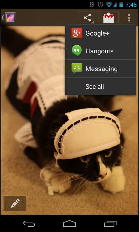
Figure 6. An action bar with
ShareActionProvider expanded to show share targets.
Similar to an action view, an action provider replaces an action button with a customized layout. However, unlike an action view, an action provider takes control of all the action's behaviors and an action provider can display a submenu when pressed.
To declare an action provider, supply the actionViewClass attribute in the
menu <item> tag with a fully-qualified class name for an
ActionProvider.
You can build your own action provider by extending the ActionProvider class, but Android provides some pre-built action providers
such as ShareActionProvider, which facilitates a "share" action
by showing a list of possible apps for sharing directly in the action bar (as shown in figure
6).
Because each ActionProvider class defines its own action
behaviors, you don't need to listen for the action in the onOptionsItemSelected() method. If necessary though,
you can still listen for the click event in the onOptionsItemSelected() method in case you need to simultaneously perform another action. But be
sure to return false so that the the action provider still receives the onPerformDefaultAction() callback to perform its intended
action.
However, if the action provider provides a submenu of actions, then your
activity does not receive a call to onOptionsItemSelected() when the user opens the list or selects one of the submenu items.
Using the ShareActionProvider
To add a "share" action with ShareActionProvider,
define the actionProviderClass for an <item> tag with
the ShareActionProvider class. For example:
<?xml version="1.0" encoding="utf-8"?>
<menu xmlns:android="http://schemas.android.com/apk/res/android"
      xmlns:yourapp="http://schemas.android.com/apk/res-auto" >
    <item android:id="@+id/action_share"
          android:title="@string/share"
          yourapp:showAsAction="ifRoom"
          yourapp:actionProviderClass="android.support.v7.widget.ShareActionProvider"
          />
    ...
</menu>
Now the action provider takes control of the action item and handles both its appearance and behavior. But you must still provide a title for the item to be used when it appears in the action overflow.
The only thing left to do is define
the Intent you want to use for sharing. To do so, edit
your onCreateOptionsMenu() method to call MenuItemCompat.getActionProvider()
and pass it the MenuItem holding the action provider. Then call setShareIntent() on the
returned ShareActionProvider and pass it an
ACTION_SEND intent with the appropriate content attached.
You should call setShareIntent() once during onCreateOptionsMenu() to initialize the share action,
but because the user context might change, you must update the intent any time the shareable
content changes by again calling setShareIntent().
For example:
private ShareActionProvider mShareActionProvider;

@Override
public boolean onCreateOptionsMenu(Menu menu) {
    getMenuInflater().inflate(R.menu.main_activity_actions, menu);

    // Set up ShareActionProvider's default share intent
    MenuItem shareItem = menu.findItem(R.id.action_share);
    mShareActionProvider = (ShareActionProvider)
            MenuItemCompat.getActionProvider(shareItem);
    mShareActionProvider.setShareIntent(getDefaultIntent());

    return super.onCreateOptionsMenu(menu);
}

/** Defines a default (dummy) share intent to initialize the action provider.
  * However, as soon as the actual content to be used in the intent
  * is known or changes, you must update the share intent by again calling
  * mShareActionProvider.setShareIntent()
  */
private Intent getDefaultIntent() {
    Intent intent = new Intent(Intent.ACTION_SEND);
    intent.setType("image/*");
    return intent;
}
The ShareActionProvider now handles all user interaction with
the item and you do not need to handle click events from the onOptionsItemSelected() callback method.
By default, the ShareActionProvider retains a ranking for each
share target based on how often the user selects each one. The share targets used more frequently
appear at the top of the drop-down list and the target used most often appears directly in the
action bar as the default share target. By default, the ranking information is saved in a private
file with a name specified by DEFAULT_SHARE_HISTORY_FILE_NAME. If you use the
ShareActionProvider or an extension of it for only one type of
action, then you should continue to use this default history file and there's nothing you need to
do. However, if you use ShareActionProvider or an extension of it
for multiple actions with semantically different meanings, then each ShareActionProvider should specify its own history file in order to
maintain its own history. To specify a different history file for the ShareActionProvider, call setShareHistoryFileName()
and provide an XML file name (for example, "custom_share_history.xml").
Note: Although the ShareActionProvider ranks share targets based on frequency of use, the
behavior is extensible and extensions of ShareActionProvider can
perform different behaviors and ranking based on the history file (if appropriate).
Creating a custom action provider
Creating your own action provider allows you to re-use and manage dynamic action item
behaviors in a self-contained module, rather than handle action item transformations and
behaviors in your fragment or activity
code. As shown in the previous section, Android already provides an implementation of ActionProvider for share actions: the ShareActionProvider.
To create your own action provider for a different action, simply extend the
ActionProvider class and implement
its callback methods as appropriate. Most importantly, you should implement the following:
ActionProvider()- This constructor passes you the application
Context, which you should save in a member field to use in the other callback methods. onCreateActionView(MenuItem)- This is where you define the action view for the item. Use the
Contextacquired from the constructor to instantiate aLayoutInflaterand inflate your action view layout from an XML resource, then hook up event listeners. For example:public View onCreateActionView(MenuItem forItem) { // Inflate the action view to be shown on the action bar. LayoutInflater layoutInflater = LayoutInflater.from(mContext); View view = layoutInflater.inflate(R.layout.action_provider, null); ImageButton button = (ImageButton) view.findViewById(R.id.button); button.setOnClickListener(new View.OnClickListener() { @Override public void onClick(View v) { // Do something... } }); return view; } onPerformDefaultAction()- The system calls this when the menu item is selected from the action overflow and the
action provider should perform a default action for the menu item.
However, if your action provider provides a submenu, through the
onPrepareSubMenu()callback, then the submenu appears even when the action provider is placed in the action overflow. Thus,onPerformDefaultAction()is never called when there is a submenu.Note: An activity or a fragment that implements
onOptionsItemSelected()can override the action provider's default behavior (unless it uses a submenu) by handling the item-selected event (and returningtrue), in which case, the system does not callonPerformDefaultAction().
For an example extension of ActionProvider, see ActionBarSettingsActionProviderActivity.
Adding Navigation Tabs

Figure 7. Action bar tabs on a wide screen.
Design Guide
Tabs
Also read
Creating Swipe Views with Tabs

Figure 8. Tabs on a narrow screen.
Tabs in the action bar make it easy for users to explore and switch between different views in
your app. The tabs provided by the ActionBar are ideal because they
adapt to different screen sizes. For example, when the screen is wide enough the tabs appear in the
action bar alongside the action buttons (such as when on a tablet, shown in figure 7), while when
on a narrow screen they appear in a separate bar (known as the "stacked action bar", shown in
figure 8). In some cases, the Android system will instead show your tab items as a drop-down list
to ensure the best fit in the action bar.
To get started, your layout must include a ViewGroup in which you place
each Fragment associated with a tab. Be sure the ViewGroup
has a resource ID so you can reference it from your code and swap the tabs within it.
Alternatively, if the tab content will fill the activity layout, then your activity doesn't need a
layout at all (you don't even need to call setContentView()). Instead, you can place each fragment in the default root view, which you can
refer to with the android.R.id.content ID.
Once you determine where the fragments appear in the layout, the basic procedure to add tabs is:
- Implement the
ActionBar.TabListenerinterface. This interface provides callbacks for tab events, such as when the user presses one so you can swap the tabs. - For each tab you want to add, instantiate an
ActionBar.Taband set theActionBar.TabListenerby callingsetTabListener(). Also set the tab's title and withsetText()(and optionally, an icon withsetIcon()). - Then add each tab to the action bar by calling
addTab().
Notice that the ActionBar.TabListener
callback methods don't specify which fragment is associated with the tab, but merely which
ActionBar.Tab was selected.
You must define your own association
between each ActionBar.Tab and the appropriate Fragment that
it represents. There are several ways you
can define the association, depending on your design.
For example, here's how you might implement the ActionBar.TabListener
such that each tab uses its own instance of the listener:
public static class TabListener<T extends Fragment> implements ActionBar.TabListener {
    private Fragment mFragment;
    private final Activity mActivity;
    private final String mTag;
    private final Class<T> mClass;

    /** Constructor used each time a new tab is created.
      * @param activity  The host Activity, used to instantiate the fragment
      * @param tag  The identifier tag for the fragment
      * @param clz  The fragment's Class, used to instantiate the fragment
      */
    public TabListener(Activity activity, String tag, Class<T> clz) {
        mActivity = activity;
        mTag = tag;
        mClass = clz;
    }

    /* The following are each of the ActionBar.TabListener callbacks */

    public void onTabSelected(Tab tab, FragmentTransaction ft) {
        // Check if the fragment is already initialized
        if (mFragment == null) {
            // If not, instantiate and add it to the activity
            mFragment = Fragment.instantiate(mActivity, mClass.getName());
            ft.add(android.R.id.content, mFragment, mTag);
        } else {
            // If it exists, simply attach it in order to show it
            ft.attach(mFragment);
        }
    }

    public void onTabUnselected(Tab tab, FragmentTransaction ft) {
        if (mFragment != null) {
            // Detach the fragment, because another one is being attached
            ft.detach(mFragment);
        }
    }

    public void onTabReselected(Tab tab, FragmentTransaction ft) {
        // User selected the already selected tab. Usually do nothing.
    }
}
Caution: You must not call commit() for the fragment transaction in each of these
callbacks—the system calls it for you and it may throw an exception if you call it yourself.
You also cannot add these fragment transactions to the back stack.
In this example, the listener simply attaches (attach()) a fragment to the activity layout—or if not instantiated, creates the fragment and
adds (add()) it to the layout (as a child of the android.R.id.content view group)—when the respective tab is selected, and detaches (detach()) it when the tab is unselected.
All that remains is to create each ActionBar.Tab and add it to the ActionBar. Additionally, you must call setNavigationMode(NAVIGATION_MODE_TABS) to make the
tabs visible.
For example, the following code adds two tabs using the listener defined above:
@Override
protected void onCreate(Bundle savedInstanceState) {
    super.onCreate(savedInstanceState);
    // Notice that setContentView() is not used, because we use the root
    // android.R.id.content as the container for each fragment

    // setup action bar for tabs
    ActionBar actionBar = getSupportActionBar();
    actionBar.setNavigationMode(ActionBar.NAVIGATION_MODE_TABS);
    actionBar.setDisplayShowTitleEnabled(false);

    Tab tab = actionBar.newTab()
                       .setText(R.string.artist)
                       .setTabListener(new TabListener<ArtistFragment>(
                               this, "artist", ArtistFragment.class));
    actionBar.addTab(tab);

    tab = actionBar.newTab()
                   .setText(R.string.album)
                   .setTabListener(new TabListener<AlbumFragment>(
                           this, "album", AlbumFragment.class));
    actionBar.addTab(tab);
}
If your activity stops, you should retain the currently selected tab with the saved instance state so you
can open the appropriate tab when the user returns. When it's time to save the state, you can query
the currently selected tab with getSelectedNavigationIndex(). This returns the index position of
the selected tab.
Caution: It's important that you save the state of each fragment so when users switch fragments with the tabs and then return to a previous fragment, it looks the way it did when they left. Some of the state is saved by default, but you may need to manually save state for customized views. For information about saving the state of your fragment, see the Fragments API guide.
Note: The above implementation for ActionBar.TabListener is one of several possible techniques. Another popular
option is to use ViewPager to manage the fragments so users
can also use a swipe gesture to switch tabs. In this case, you simply tell the
ViewPager the current tab position in the
onTabSelected() callback.
For more information, read
Creating Swipe Views with Tabs.
Adding Drop-down Navigation
Figure 9. A drop-down navigation list in the action bar.
As another mode of navigation (or filtering) for your activity, the action bar offers a built in drop-down list (also known as a "spinner"). For example, the drop-down list can offer different modes by which content in the activity is sorted.
Using the drop-down list is useful when changing the content is important but not necessarily a frequent occurrence. In cases where switching the content is more frequent, you should use navigation tabs instead.
The basic procedure to enable drop-down navigation is:
- Create a
SpinnerAdapterthat provides the list of selectable items for the drop-down and the layout to use when drawing each item in the list. - Implement
ActionBar.OnNavigationListenerto define the behavior that occurs when the user selects an item from the list. - During your activity's
onCreate()method, enable the action bar's drop-down list by callingsetNavigationMode(NAVIGATION_MODE_LIST). - Set the callback for the drop-down list with
setListNavigationCallbacks(). For example:actionBar.setListNavigationCallbacks(mSpinnerAdapter, mNavigationCallback);
This method takes your
SpinnerAdapterandActionBar.OnNavigationListener.
This procedure is relatively short, but implementing the SpinnerAdapter
and ActionBar.OnNavigationListener is where most of the work is done. There are
many ways you can implement these to define the functionality for your drop-down navigation and
implementing various types of SpinnerAdapter is beyond the scope of this
document (you should refer to the SpinnerAdapter class reference for more
information). However, below is an example for a SpinnerAdapter and ActionBar.OnNavigationListener to get you started (click the title to reveal the
sample).
 Example SpinnerAdapter and OnNavigationListener
SpinnerAdapter is an adapter that provides data for a spinner widget,
such as the drop-down list in the action bar. SpinnerAdapter is an interface
that you can implement, but Android includes some useful implementations that you can extend, such
as ArrayAdapter and SimpleCursorAdapter. For example, here's an easy way to create a SpinnerAdapter by using ArrayAdapter implementation, which
uses a string array as the data source:
SpinnerAdapter mSpinnerAdapter = ArrayAdapter.createFromResource(this, R.array.action_list,
          android.R.layout.simple_spinner_dropdown_item);
The createFromResource() method takes
three parameters: the application Context, the resource ID for the string
array, and the layout to use for each list item.
A string array defined in a resource looks like this:
<?xml version="1.0" encoding="utf-8"?>
<resources>
    <string-array name="action_list">
        <item>Mercury</item>
        <item>Venus</item>
        <item>Earth</item>
    </string-array>
</pre>
The ArrayAdapter returned by createFromResource() is complete and ready for you
to pass it to setListNavigationCallbacks()
(in step 4 from above). Before you do, though, you need to create the OnNavigationListener.
Your implementation of ActionBar.OnNavigationListener is where you handle
fragment changes or other modifications to your activity when the user selects an item from the
drop-down list. There's only one callback method to implement in the listener: onNavigationItemSelected().
The onNavigationItemSelected()
method receives the position of the item in the list and a unique item ID provided by the SpinnerAdapter.
Here's an example that instantiates an anonymous implementation of OnNavigationListener, which inserts a Fragment into the
layout container identified by R.id.fragment_container:
mOnNavigationListener = new OnNavigationListener() {
  // Get the same strings provided for the drop-down's ArrayAdapter
  String[] strings = getResources().getStringArray(R.array.action_list);

  @Override
  public boolean onNavigationItemSelected(int position, long itemId) {
    // Create new fragment from our own Fragment class
    ListContentFragment newFragment = new ListContentFragment();
    FragmentTransaction ft = openFragmentTransaction();
    // Replace whatever is in the fragment container with this fragment
    //  and give the fragment a tag name equal to the string at the position selected
    ft.replace(R.id.fragment_container, newFragment, strings[position]);
    // Apply changes
    ft.commit();
    return true;
  }
};
This instance of OnNavigationListener is
complete and you can now call setListNavigationCallbacks() (in step 4), passing the ArrayAdapter and this
OnNavigationListener.
In this example, when the user selects an item from the drop-down list, a fragment is added to
the layout (replacing the current fragment in the R.id.fragment_container view). The
fragment added is given a tag that uniquely identifies it, which is the same string used to
identify the fragment in the drop-down list.
Here's a look at the ListContentFragment class that defines each fragment in this
example:
public class ListContentFragment extends Fragment {
    private String mText;

    @Override
    public void onAttach(Activity activity) {
      // This is the first callback received; here we can set the text for
      // the fragment as defined by the tag specified during the fragment transaction
      super.onAttach(activity);
      mText = getTag();
    }

    @Override
    public View onCreateView(LayoutInflater inflater, ViewGroup container,
            Bundle savedInstanceState) {
        // This is called to define the layout for the fragment;
        // we just create a TextView and set its text to be the fragment tag
        TextView text = new TextView(getActivity());
        text.setText(mText);
        return text;
    }
}
Styling the Action Bar
If you want to implement a visual design that represents your app's brand, the action bar allows you to customize each detail of its appearance, including the action bar color, text colors, button styles, and more. To do so, you need to use Android's style and theme framework to restyle the action bar using special style properties.
Caution: For all background drawables you provide, be sure to use Nine-Patch drawables to allow stretching. The nine-patch image should be smaller than 40dp tall and 30dp wide.
General appearance
actionBarStyle- Specifies a style resource that defines various style properties
for the action bar.
The default for this style for this is
Widget.AppCompat.ActionBar, which is what you should use as the parent style.Supported styles include:
background- Defines a drawable resource for the action bar background.
backgroundStacked- Defines a drawable resource for the stacked action bar (the tabs).
backgroundSplit- Defines a drawable resource for the split action bar.
actionButtonStyle- Defines a style resource for action buttons.
The default for this style for this is
Widget.AppCompat.ActionButton, which is what you should use as the parent style. actionOverflowButtonStyle- Defines a style resource for overflow action items.
The default for this style for this is
Widget.AppCompat.ActionButton.Overflow, which is what you should use as the parent style. displayOptions- Defines one or more action bar display options, such as whether to use the app logo,
show the activity title, or enable the Up action. See
displayOptionsfor all possible values. divider- Defines a drawable resource for the divider between action items.
titleTextStyle- Defines a style resource for the action bar title.
The default for this style for this is
TextAppearance.AppCompat.Widget.ActionBar.Title, which is what you should use as the parent style.
windowActionBarOverlay- Declares whether the action bar should overlay the activity layout rather than offset the
activity's layout position (for example, the Gallery app uses overlay mode). This is
falseby default.Normally, the action bar requires its own space on the screen and your activity layout fills in what's left over. When the action bar is in overlay mode, your activity layout uses all the available space and the system draws the action bar on top. Overlay mode can be useful if you want your content to keep a fixed size and position when the action bar is hidden and shown. You might also like to use it purely as a visual effect, because you can use a semi-transparent background for the action bar so the user can still see some of your activity layout behind the action bar.
Note: The
Holotheme families draw the action bar with a semi-transparent background by default. However, you can modify it with your own styles and theDeviceDefaulttheme on different devices might use an opaque background by default.When overlay mode is enabled, your activity layout has no awareness of the action bar lying on top of it. So, you must be careful not to place any important information or UI components in the area overlaid by the action bar. If appropriate, you can refer to the platform's value for
actionBarSizeto determine the height of the action bar, by referencing it in your XML layout. For example:<SomeView ... android:layout_marginTop="?android:attr/actionBarSize" />You can also retrieve the action bar height at runtime with
getHeight(). This reflects the height of the action bar at the time it's called, which might not include the stacked action bar (due to navigation tabs) if called during early activity lifecycle methods. To see how you can determine the total height at runtime, including the stacked action bar, see theTitlesFragmentclass in the Honeycomb Gallery sample app.
Action items
actionButtonStyle- Defines a style resource for the action item buttons.
The default for this style for this is
Widget.AppCompat.ActionButton, which is what you should use as the parent style. actionBarItemBackground- Defines a drawable resource for each action item's background. This should be a state-list drawable to indicate different selected states.
itemBackground- Defines a drawable resource for each action overflow item's background. This should be a state-list drawable to indicate different selected states.
actionBarDivider- Defines a drawable resource for the divider between action items.
actionMenuTextColor- Defines a color for text that appears in an action item.
actionMenuTextAppearance- Defines a style resource for text that appears in an action item.
actionBarWidgetTheme- Defines a theme resource for widgets that are inflated into the action bar as action views.
Navigation tabs
actionBarTabStyle- Defines a style resource for tabs in the action bar.
The default for this style for this is
Widget.AppCompat.ActionBar.TabView, which is what you should use as the parent style. actionBarTabBarStyle- Defines a style resource for the thin bar that appears below the navigation tabs.
The default for this style for this is
Widget.AppCompat.ActionBar.TabBar, which is what you should use as the parent style. actionBarTabTextStyle- Defines a style resource for text in the navigation tabs.
The default for this style for this is
Widget.AppCompat.ActionBar.TabText, which is what you should use as the parent style.
Drop-down lists
actionDropDownStyle- Defines a style for the drop-down navigation (such as the background and text styles).
The default for this style for this is
Widget.AppCompat.Spinner.DropDown.ActionBar, which is what you should use as the parent style.
Example theme
Here's an example that defines a custom theme for an activity, CustomActivityTheme,
that includes several styles to customize the action bar.
Notice that there are two version for each action bar style property. The first one
includes the android: prefix on the property name to support API levels 11 and higher
that include these properties in the framework. The second version does not
include the android: prefix and is for older versions of the platform, on which
the system uses the style property from the support library. The effect for each is the same.
<?xml version="1.0" encoding="utf-8"?>
<resources>
    <!-- the theme applied to the application or activity -->
    <style name="CustomActionBarTheme"
           parent="@style/Theme.AppCompat.Light">
        <item name="android:actionBarStyle">@style/MyActionBar</item>
        <item name="android:actionBarTabTextStyle">@style/TabTextStyle</item>
        <item name="android:actionMenuTextColor">@color/actionbar_text</item>

        <!-- Support library compatibility -->
        <item name="actionBarStyle">@style/MyActionBar</item>
        <item name="actionBarTabTextStyle">@style/TabTextStyle</item>
        <item name="actionMenuTextColor">@color/actionbar_text</item>
    </style>

    <!-- general styles for the action bar -->
    <style name="MyActionBar"
           parent="@style/Widget.AppCompat.ActionBar">
        <item name="android:titleTextStyle">@style/TitleTextStyle</item>
        <item name="android:background">@drawable/actionbar_background</item>
        <item name="android:backgroundStacked">@drawable/actionbar_background</item>
        <item name="android:backgroundSplit">@drawable/actionbar_background</item>

        <!-- Support library compatibility -->
        <item name="titleTextStyle">@style/TitleTextStyle</item>
        <item name="background">@drawable/actionbar_background</item>
        <item name="backgroundStacked">@drawable/actionbar_background</item>
        <item name="backgroundSplit">@drawable/actionbar_background</item>
    </style>

    <!-- action bar title text -->
    <style name="TitleTextStyle"
           parent="@style/TextAppearance.AppCompat.Widget.ActionBar.Title">
        <item name="android:textColor">@color/actionbar_text</item>
    </style>

    <!-- action bar tab text -->
    <style name="TabTextStyle"
           parent="@style/Widget.AppCompat.ActionBar.TabText">
        <item name="android:textColor">@color/actionbar_text</item>
    </style>
</resources>
In your manifest file, you can apply the theme to your entire app:
<application android:theme="@style/CustomActionBarTheme" ... />
Or to individual activities:
<activity android:theme="@style/CustomActionBarTheme" ... />
Caution: Be certain that each theme and style declares a parent
theme in the <style> tag, from which it inherits all styles not explicitly declared
by your theme. When modifying the action bar, using a parent theme is important so that you can
simply override the action bar styles you want to change without re-implementing the styles you
want to leave alone (such as text size or padding in action items).
For more information about using style and theme resources in your application, read Styles and Themes.