This lesson teaches you to
You should also read
The action bar provides your users a familiar and predictable way to perform actions and navigate your app, but that doesn't mean it needs to look exactly the same as it does in other apps. If you want to style the action bar to better fit your product brand, you can easily do so using Android's style and theme resources.
Android includes a few built-in activity themes that include "dark" or "light" action bar styles. You can also extend these themes to further customize the look for your action bar.
Note: If you are using the Support Library APIs
for the action bar, then you must use (or override) the Theme.AppCompat family of styles (rather
than the Theme.Holo family, available in API level 11 and
higher). In doing so, each style property that you declare must be declared twice: once using
the platform's style properties (the
android: properties) and once using the
style properties included in the Support Library (the appcompat.R.attr properties—the context for these properties is actually
your app). See the examples below for details.
Use an Android Theme
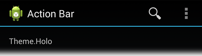
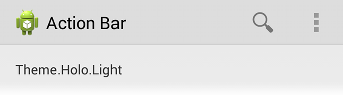
Android includes two baseline activity themes that dictate the color for the action bar:
Theme.Holofor a "dark" theme.Theme.Holo.Lightfor a "light" theme.
You can apply these themes to your entire app or to individual activities by
declaring them in your manifest file with the android:theme attribute
for the <application> element or individual
<activity>
elements.
For example:
<application android:theme="@android:style/Theme.Holo.Light" ... />
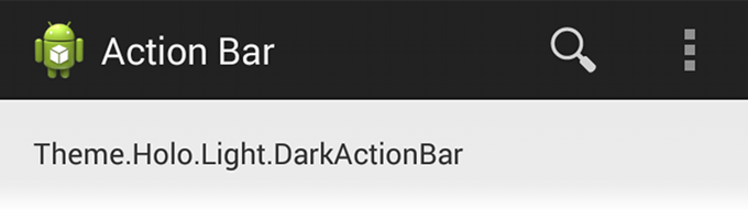
You can also use a dark action bar while the rest of the activity uses the light
color scheme by declaring the Theme.Holo.Light.DarkActionBar theme.
When using the Support Library, you must instead use the
Theme.AppCompat themes:
Theme.AppCompatfor the "dark" theme.Theme.AppCompat.Lightfor the "light" theme.Theme.AppCompat.Light.DarkActionBarfor the light theme with a dark action bar.
Be sure that you use action bar icons that properly contrast with the color of your action bar. To help you, the Action Bar Icon Pack includes standard action icons for use with both the Holo light and Holo dark action bar.
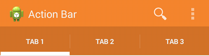
Customize the Background
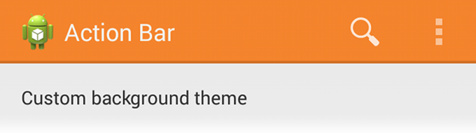
To change the action bar background, create a custom theme for your activity that overrides the
actionBarStyle property. This property points to another style
in which you can override the background property to specify
a drawable resource for the action bar background.
If your app uses navigation tabs
or the split
action bar, then you can also specify the background for these bars using
the backgroundStacked and
backgroundSplit properties, respectively.
Caution: It's important that you declare an appropriate parent theme from which your custom theme and style inherit their styles. Without a parent style, your action bar will be without many style properties unless you explicitly declare them yourself.
For Android 3.0 and higher only
When supporting Android 3.0 and higher only, you can define the action bar's background like this:
res/values/themes.xml
<?xml version="1.0" encoding="utf-8"?>
<resources>
    <!-- the theme applied to the application or activity -->
    <style name="CustomActionBarTheme"
           parent="@style/Theme.Holo.Light.DarkActionBar">
        <item name="android:actionBarStyle">@style/MyActionBar</item>
    </style>

    <!-- ActionBar styles -->
    <style name="MyActionBar"
           parent="@style/Widget.Holo.Light.ActionBar.Solid.Inverse">
        <item name="android:background">@drawable/actionbar_background</item>
    </style>
</resources>
Then apply your theme to your entire app or individual activities:
<application android:theme="@style/CustomActionBarTheme" ... />
For Android 2.1 and higher
When using the Support Library, the same theme as above must instead look like this:
res/values/themes.xml
<?xml version="1.0" encoding="utf-8"?>
<resources>
    <!-- the theme applied to the application or activity -->
    <style name="CustomActionBarTheme"
           parent="@style/Theme.AppCompat.Light.DarkActionBar">
        <item name="android:actionBarStyle">@style/MyActionBar</item>

        <!-- Support library compatibility -->
        <item name="actionBarStyle">@style/MyActionBar</item>
    </style>

    <!-- ActionBar styles -->
    <style name="MyActionBar"
           parent="@style/Widget.AppCompat.Light.ActionBar.Solid.Inverse">
        <item name="android:background">@drawable/actionbar_background</item>

        <!-- Support library compatibility -->
        <item name="background">@drawable/actionbar_background</item>
    </style>
</resources>
Then apply your theme to your entire app or individual activities:
<application android:theme="@style/CustomActionBarTheme" ... />
Customize the Text Color
To modify the color of text in the action bar, you need to override separate properties for each text element:
- Action bar title: Create a custom style that specifies the
textColorproperty and specify that style for thetitleTextStyleproperty in your customactionBarStyle.Note: The custom style applied to
titleTextStyleshould useTextAppearance.Holo.Widget.ActionBar.Titleas the parent style. - Action bar tabs: Override
actionBarTabTextStylein your activity theme. - Action buttons: Override
actionMenuTextColorin your activity theme.
For Android 3.0 and higher only
When supporting Android 3.0 and higher only, your style XML file might look like this:
res/values/themes.xml
<?xml version="1.0" encoding="utf-8"?>
<resources>
    <!-- the theme applied to the application or activity -->
    <style name="CustomActionBarTheme"
           parent="@style/Theme.Holo">
        <item name="android:actionBarStyle">@style/MyActionBar</item>
        <item name="android:actionBarTabTextStyle">@style/MyActionBarTabText</item>
        <item name="android:actionMenuTextColor">@color/actionbar_text</item>
    </style>

    <!-- ActionBar styles -->
    <style name="MyActionBar"
           parent="@style/Widget.Holo.ActionBar">
        <item name="android:titleTextStyle">@style/MyActionBarTitleText</item>
    </style>

    <!-- ActionBar title text -->
    <style name="MyActionBarTitleText"
           parent="@style/TextAppearance.Holo.Widget.ActionBar.Title">
        <item name="android:textColor">@color/actionbar_text</item>
    </style>

    <!-- ActionBar tabs text styles -->
    <style name="MyActionBarTabText"
           parent="@style/Widget.Holo.ActionBar.TabText">
        <item name="android:textColor">@color/actionbar_text</item>
    </style>
</resources>
For Android 2.1 and higher
When using the Support Library, your style XML file might look like this:
res/values/themes.xml
<?xml version="1.0" encoding="utf-8"?>
<resources>
    <!-- the theme applied to the application or activity -->
    <style name="CustomActionBarTheme"
           parent="@style/Theme.AppCompat">
        <item name="android:actionBarStyle">@style/MyActionBar</item>
        <item name="android:actionBarTabTextStyle">@style/MyActionBarTabText</item>
        <item name="android:actionMenuTextColor">@color/actionbar_text</item>

        <!-- Support library compatibility -->
        <item name="actionBarStyle">@style/MyActionBar</item>
        <item name="actionBarTabTextStyle">@style/MyActionBarTabText</item>
        <item name="actionMenuTextColor">@color/actionbar_text</item>
    </style>

    <!-- ActionBar styles -->
    <style name="MyActionBar"
           parent="@style/Widget.AppCompat.ActionBar">
        <item name="android:titleTextStyle">@style/MyActionBarTitleText</item>

        <!-- Support library compatibility -->
        <item name="titleTextStyle">@style/MyActionBarTitleText</item>
    </style>

    <!-- ActionBar title text -->
    <style name="MyActionBarTitleText"
           parent="@style/TextAppearance.AppCompat.Widget.ActionBar.Title">
        <item name="android:textColor">@color/actionbar_text</item>
        <!-- The textColor property is backward compatible with the Support Library -->
    </style>

    <!-- ActionBar tabs text -->
    <style name="MyActionBarTabText"
           parent="@style/Widget.AppCompat.ActionBar.TabText">
        <item name="android:textColor">@color/actionbar_text</item>
        <!-- The textColor property is backward compatible with the Support Library -->
    </style>
</resources>
Customize the Tab Indicator
To change the indicator used for the navigation tabs,
create an activity theme that overrides the
actionBarTabStyle property. This property points to another style
resource in which you override the background property that should specify
a state-list drawable.
Note: A state-list drawable is important so that the tab currently selected indicates its state with a background different than the other tabs. For more information about how to create a drawable resource that handles multiple button states, read the State List documentation.
For example, here's a state-list drawable that declares a specific background image for several different states of an action bar tab:
res/drawable/actionbar_tab_indicator.xml
<?xml version="1.0" encoding="utf-8"?>
<selector xmlns:android="http://schemas.android.com/apk/res/android">

<!-- STATES WHEN BUTTON IS NOT PRESSED -->

    <!-- Non focused states -->
    <item android:state_focused="false" android:state_selected="false"
          android:state_pressed="false"
          android:drawable="@drawable/tab_unselected" />
    <item android:state_focused="false" android:state_selected="true"
          android:state_pressed="false"
          android:drawable="@drawable/tab_selected" />

    <!-- Focused states (such as when focused with a d-pad or mouse hover) -->
    <item android:state_focused="true" android:state_selected="false"
          android:state_pressed="false"
          android:drawable="@drawable/tab_unselected_focused" />
    <item android:state_focused="true" android:state_selected="true"
          android:state_pressed="false"
          android:drawable="@drawable/tab_selected_focused" />


<!-- STATES WHEN BUTTON IS PRESSED -->

    <!-- Non focused states -->
    <item android:state_focused="false" android:state_selected="false"
          android:state_pressed="true"
          android:drawable="@drawable/tab_unselected_pressed" />
    <item android:state_focused="false" android:state_selected="true"
        android:state_pressed="true"
        android:drawable="@drawable/tab_selected_pressed" />

    <!-- Focused states (such as when focused with a d-pad or mouse hover) -->
    <item android:state_focused="true" android:state_selected="false"
          android:state_pressed="true"
          android:drawable="@drawable/tab_unselected_pressed" />
    <item android:state_focused="true" android:state_selected="true"
          android:state_pressed="true"
          android:drawable="@drawable/tab_selected_pressed" />
</selector>
For Android 3.0 and higher only
When supporting Android 3.0 and higher only, your style XML file might look like this:
res/values/themes.xml
<?xml version="1.0" encoding="utf-8"?>
<resources>
    <!-- the theme applied to the application or activity -->
    <style name="CustomActionBarTheme"
           parent="@style/Theme.Holo">
        <item name="android:actionBarTabStyle">@style/MyActionBarTabs</item>
    </style>

    <!-- ActionBar tabs styles -->
    <style name="MyActionBarTabs"
           parent="@style/Widget.Holo.ActionBar.TabView">
        <!-- tab indicator -->
        <item name="android:background">@drawable/actionbar_tab_indicator</item>
    </style>
</resources>
For Android 2.1 and higher
When using the Support Library, your style XML file might look like this:
res/values/themes.xml
<?xml version="1.0" encoding="utf-8"?>
<resources>
    <!-- the theme applied to the application or activity -->
    <style name="CustomActionBarTheme"
           parent="@style/Theme.AppCompat">
        <item name="android:actionBarTabStyle">@style/MyActionBarTabs</item>

        <!-- Support library compatibility -->
        <item name="actionBarTabStyle">@style/MyActionBarTabs</item>
    </style>

    <!-- ActionBar tabs styles -->
    <style name="MyActionBarTabs"
           parent="@style/Widget.AppCompat.ActionBar.TabView">
        <!-- tab indicator -->
        <item name="android:background">@drawable/actionbar_tab_indicator</item>

        <!-- Support library compatibility -->
        <item name="background">@drawable/actionbar_tab_indicator</item>
    </style>
</resources>
More resources
- See more style properties for the action bar are listed in the Action Bar guide.
- Learn more about how themes work in the Styles and Themes guide.
- For even more complete styling for the action bar, try the Android Action Bar Style Generator.