Quickview
- You can target your web page for different screens using viewport metadata, CSS, and JavaScript
- Techniques in this document work for Android 2.0 and greater, and for web pages rendered
in the default Android Browser and in a
WebView
In this document
If you're developing a web application for Android or redesigning one for mobile devices, you should carefully consider how your web pages appear on different kinds of screens. Because Android is available on devices with different types of screens, you should account for some factors that affect the way your web pages appear on Android devices.
Note: The features described in this document are supported
by the Android Browser application (provided with the default Android platform) and WebView (the framework view widget for displaying web pages), on Android 2.0 and
greater. Third-party web browsers running on Android might not support these features for
controlling the viewport size and screen densities.
When targeting your web pages for Android devices, there are two fundamental factors that you should account for:
- The size of the viewport and scale of the web page
- When the Android Browser loads a web page, the default behavior is to load the
page in "overview mode," which provides a zoomed-out perspective of the web page. You can override
this behavior for your web page by defining the default dimensions of the viewport or the initial
scale of the viewport. You can also control how much the user can zoom in and out of your web
page, if at all. The user can also disable overview mode in the
Browser settings, so you should never assume that your page will load in overview mode. You
should instead customize the viewport size and/or scale as appropriate for your page.
However, when your page is rendered in a
WebView, the page loads at full zoom (not in "overview mode"). That is, it appears at the default size for the page, instead of zoomed out. (This is also how the page appears if the user disables overview mode.) - The device's screen density
- The screen density (the number of pixels per inch) on an Android-powered device affects
the resolution and size at which a web page is displayed. (There are three screen density
categories: low, medium, and high.) The Android Browser and
WebViewcompensate for variations in the screen density by scaling a web page so that all devices display the web page at the same perceivable size as a medium-density screen. If graphics are an important element of your web design, you should pay close attention to the scaling that occurs on different densities, because image scaling can produce artifacts (blurring and pixelation).To provide the best visual representation on all screen densities, you should control how scaling occurs by providing viewport metadata about your web page's target screen density and providing alternative graphics for different screen densities, which you can apply to different screens using CSS or JavaScript.
The rest of this document describes how you can account for these effects and provide a good design on multiple types of screens.
Using Viewport Metadata
The viewport is the area in which your web page is drawn. Although the viewport's visible area matches the size of the screen, the viewport has its own dimensions that determine the number of pixels available to a web page. That is, the number of pixels available to a web page before it exceeds the screen area is defined by the dimensions of the viewport, not the dimensions of the device screen. For example, although a device screen might have a width of 480 pixels, the viewport can have a width of 800 pixels, so that a web page designed to be 800 pixels wide is completely visible on the screen.
You can define properties of the viewport for your web page using the "viewport"
property in an HTML <meta> tag (which must
be placed in your document <head>). You can define multiple viewport properties in the
<meta> tag's content attribute. For example, you can define the height and
width of the viewport, the initial scale of the page, and the target screen density.
Each viewport property in the content attribute must be separated by a comma.
For example, the following snippet from an HTML document specifies that the viewport width should exactly match the device screen width and that the ability to zoom should be disabled:
<head>
    <title>Example</title>
    <meta name="viewport" content="width=device-width, user-scalable=no" />
</head>
That's an example of just two viewport properties. The following syntax shows all of the supported viewport properties and the general types of values accepted by each one:
<meta name="viewport"
      content="
          height = [pixel_value | device-height] ,
          width = [pixel_value | device-width ] ,
          initial-scale = float_value ,
          minimum-scale = float_value ,
          maximum-scale = float_value ,
          user-scalable = [yes | no] ,
          target-densitydpi = [dpi_value | device-dpi |
                               high-dpi | medium-dpi | low-dpi]
          " />
The following sections discuss how to use each of these viewport properties and exactly what the accepted values are.
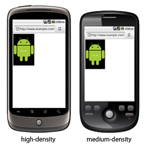
Figure 1. A web page with an image that's 320 pixels wide, in the Android Browser when there is no viewport metadata set (with "overview mode" enabled, the viewport is 800 pixels wide, by default).
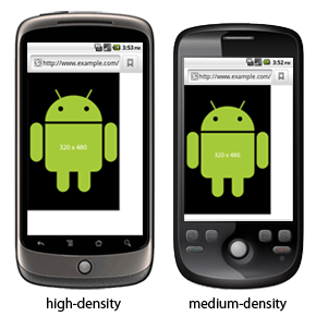
Figure 2. A web page with viewport width=400 and
"overview mode" enabled (the image in the web page is 320 pixels wide).
Defining the viewport size
Viewport's height and width properties allow you to specify the size of the
viewport (the number of pixels available to the web page before it goes off screen).
As mentioned in the introduction above, the Android Browser loads pages in "overview mode" by
default (unless disable by the user), which sets the minimum viewport width to 800 pixels. So, if
your web page specifies its size to be 320 pixels wide, then your page appears smaller than the
visible screen (even if the physical screen is 320 pixels wide, because the viewport simulates a
drawable area that's 800 pixels wide), as shown in figure 1. To avoid this effect, you should
explicitly define the viewport width to match the width for which you have designed your web
page.
For example, if your web page is designed to be exactly 320 pixels wide, then you might want to specify that size for the viewport width:
<meta name="viewport" content="width=320" />
In this case, your web page exactly fits the screen width, because the web page width and viewport width are the same.
Note: Width values that are greater than 10,000 are ignored and values less than (or equal to) 320 result in a value equal to the device-width (discussed below). Height values that are greater then 10,000 or less than 200 are also ignored.
To demonstrate how this property affects the size of your web page, figure 2 shows a web page that contains an image that's 320 pixels wide, but with the viewport width set to 400.
Note: If you set the viewport width to match your web page width
and the device's screen width does not match those dimensions, then the web page
still fits the screen even if the device has a high or low-density screen, because the
Android Browser and WebView scale web pages to match the perceived size on a
medium-density screen, by default (as you can see in figure 2, when comparing the hdpi device to the
mdpi device). Screen densities are discussed more in Defining the
viewport target density.
Automatic sizing
As an alternative to specifying the viewport dimensions with exact pixels, you can set the
viewport size to always match the dimensions of the device screen, by defining the
viewport properties height
and width with the values device-height and device-width, respectively. This
is appropriate when you're developing a web application that has a fluid width (not fixed width),
but you want it to appear as if it's fixed (to perfectly fit every screen as
if the web page width is set to match each screen). For example:
<meta name="viewport" content="width=device-width" />
This results in the viewport width matching whatever the current screen width is, as shown in figure 3. It's important to notice that, this results in images being scaled to fit the screen when the current device does not match the target density, which is medium-density if you don't specify otherwise. As a result, the image displayed on the high-density device in figure 3 is scaled up in order to match the width of a screen with a medium-density screen.
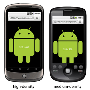
Figure 3. A web page with viewport width=device-width or initial-scale=1.0.
Note: If you instead want device-width and device-height to match the physical screen pixels for every device,
instead of scaling your web page to match the target density, then you must also include
the target-densitydpi property with a value of device-dpi. This is discussed more in
the section about Defining the viewport density. Otherwise, simply
using device-height and device-width to define the viewport size makes your web page
fit every device screen, but scaling occurs on your images in order to adjust for different screen
densities.
Defining the viewport scale
The scale of the viewport defines the level of zoom applied to the web page. Viewport properties allow you to specify the scale of your web page in the following ways:
initial-scale- The initial scale of the page. The value is a float that indicates a multiplier for your web
page size, relative to the screen size. For example, if you set the initial scale to "1.0" then the
web page is displayed to match the resolution of the target
density 1-to-1. If set to "2.0", then the page is enlarged (zoomed in) by a factor of 2.
The default initial scale is calculated to fit the web page in the viewport size. Because the default viewport width is 800 pixels, if the device screen resolution is less than 800 pixels wide, the initial scale is something less than 1.0, by default, in order to fit the 800-pixel-wide page on the screen.
minimum-scale- The minimum scale to allow. The value is a float that indicates the minimum multiplier for your web page size, relative to the screen size. For example, if you set this to "1.0", then the page can't zoom out because the minimum size is 1-to-1 with the target density.
maximum-scale- The maximum scale to allow for the page. The value is a float that indicates the maximum multiplier for your web page size, relative to the screen size. For example, if you set this to "2.0", then the page can't zoom in more than 2 times the target size.
user-scalable- Whether the user can change the scale of the page at all (zoom in and out). Set to
yesto allow scaling andnoto disallow scaling. The default isyes. If you set this tono, then theminimum-scaleandmaximum-scaleare ignored, because scaling is not possible.
All scale values must be within the range 0.01–10.
For example:
<meta name="viewport" content="initial-scale=1.0" />
This metadata sets the initial scale to be full sized, relative to the viewport's target density.
Defining the viewport target density
The density of a device's screen is based on the screen resolution, as defined by the number of
dots per inch (dpi). There are three screen
density categories supported by Android: low (ldpi), medium (mdpi), and high (hdpi). A screen
with low density has fewer available pixels per inch, whereas a screen with high density has more
pixels per inch (compared to a medium density screen). The Android Browser and WebView target a medium density screen by default.
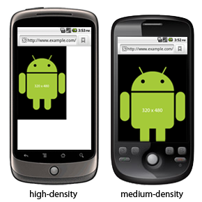
Figure 4. A web page with viewport width=device-width and target-densitydpi=device-dpi.
Because the default target density is medium, when users have a device with a low or high density
screen, the Android Browser and WebView scale web pages (effectively zoom
the pages) so they display at a
size that matches the perceived appearance on a medium density screen. More specifically, the
Android Browser and WebView apply approximately 1.5x scaling to web pages
on a high density screen (because its screen pixels are smaller) and approximately 0.75x scaling to
pages on a low density screen (because its screen pixels are bigger).
Due to this default scaling, figures 1, 2, and 3 show the example web page at the same physical size on both the high and medium density device (the high-density device shows the web page with a default scale factor that is 1.5 times larger than the actual pixel resolution, to match the target density). This can introduce some undesirable artifacts in your images. For example, although an image appears the same size on a medium and high-density device, the image on the high-density device appears more blurry, because the image is designed to be 320 pixels wide, but is drawn with 480 pixels.
You can change the target screen density for your web page using the target-densitydpi
viewport property. It accepts the following values:
device-dpi- Use the device's native dpi as the target dpi. Default scaling never occurs.high-dpi- Use hdpi as the target dpi. Medium and low density screens scale down as appropriate.medium-dpi- Use mdpi as the target dpi. High density screens scale up and low density screens scale down. This is the default target density.low-dpi- Use ldpi as the target dpi. Medium and high density screens scale up as appropriate.<value>- Specify a dpi value to use as the target dpi. Values must be within the range 70–400.
For example, to prevent the Android Browser and WebView from scaling
your web page for different screen densities, set
the target-densitydpi viewport property to device-dpi. When you do, the page is
not scaled. Instead, the page is displayed at a size that matches the current screen's
density. In this case, you should also define the viewport width to match the device width, so your
web page naturally fits the screen size. For example:
<meta name="viewport" content="target-densitydpi=device-dpi, width=device-width" />
Figure 4 shows a web page using these viewport settings—the high-density device now displays the page smaller because its physical pixels are smaller than those on the medium-density device, so no scaling occurs and the 320-pixel-wide image is drawn using exactly 320 pixels on both screens. (This is how you should define your viewport if you want to customize your web page based on screen density and provide different image assets for different densities, with CSS or with JavaScript.)
Targeting Device Density with CSS
The Android Browser and WebView support a CSS media feature that allows
you to create styles for specific
screen densities—the -webkit-device-pixel-ratio CSS media feature. The
value you apply to this feature should be either
"0.75", "1", or "1.5", to indicate that the styles are for devices with low density, medium density,
or high density screens, respectively.
For example, you can create separate stylesheets for each density:
<link rel="stylesheet" media="screen and (-webkit-device-pixel-ratio: 1.5)" href="hdpi.css" />
<link rel="stylesheet" media="screen and (-webkit-device-pixel-ratio: 1.0)" href="mdpi.css" />
<link rel="stylesheet" media="screen and (-webkit-device-pixel-ratio: 0.75)" href="ldpi.css" />
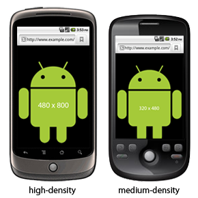
Figure 5. A web page with CSS that's targetted to
specific screen densities using the -webkit-device-pixel-ratio media feature. Notice
that the hdpi device shows a different image that's applied in CSS.
Or, specify the different styles in one stylesheet:
#header {
    background:url(medium-density-image.png);
}

@media screen and (-webkit-device-pixel-ratio: 1.5) {
    /* CSS for high-density screens */
    #header {
        background:url(high-density-image.png);
    }
}

@media screen and (-webkit-device-pixel-ratio: 0.75) {
    /* CSS for low-density screens */
    #header {
        background:url(low-density-image.png);
    }
}
Note: The default style for #header applies the image
designed for medium-density devices in order to support devices running a version of Android less
than 2.0, which do not support the -webkit-device-pixel-ratio media feature.
The types of styles you might want to adjust based on the screen density depend on how you've defined your viewport properties. To provide fully-customized styles that tailor your web page for each of the supported densities, you should set your viewport properties so the viewport width and density match the device. That is:
<meta name="viewport" content="target-densitydpi=device-dpi, width=device-width" />
This way, the Android Browser and WebView do not perform scaling on your
web page and the viewport width
matches the screen width exactly. On their own, these viewport properties create results shown in
figure 4. However, by adding some custom CSS using the -webkit-device-pixel-ratio media
feature, you can apply different styles. For example, figure 5 shows a web page with these viewport
properties and also some CSS added that applies a high-resolution image for high-density
screens.
Targeting Device Density with JavaScript
The Android Browser and WebView support a DOM property that allows you to
query the density of the current
device—the window.devicePixelRatio DOM property. The value of this property
specifies the scaling factor used for the current device. For example, if the value
of window.devicePixelRatio is "1.0", then the device is considered a medium density
device and no scaling is applied by default; if the value is "1.5", then the device is
considered a high density device and the page is scaled 1.5x by default; if the value
is "0.75", then the device is considered a low density device and the page is scaled
0.75x by default. Of course, the scaling that the Android Browser and WebView
apply is based on the web page's
target density—as described in the section about Defining the
viewport target density, the default target is medium-density, but you can change the
target to affect how your web page is scaled for different screen densities.
For example, here's how you can query the device density with JavaScript:
if (window.devicePixelRatio == 1.5) {
  alert("This is a high-density screen");
} else if (window.devicePixelRatio == 0.75) {
  alert("This is a low-density screen");
}