Developer Docs
Implementing Accessibility
One of Android's missions is to organize the world's information and make it universally accessible and useful. Accessibility is the measure of how successfully a product can be used by people with varying abilities. Our mission applies to all users-including people with disabilities such as visual impairment, color deficiency, hearing loss, and limited dexterity.
Universal design is the practice of making products that are inherently accessible to all users, regardless of ability. The Android design patterns were created in accordance with universal design principles, and following them will help your app meet basic usability standards. Adhering to universal design and enabling Android's accessibility tools will make your app as accessible as possible.
Robust support for accessibility will increase your app's user base. It may also be required for adoption by some organizations.
Learn more about Google and accessibility.
Android's Accessibility Tools
Android includes several features that support access for users with visual impairments; they don't require drastic visual changes to your app.
- TalkBack is a pre-installed screen reader service provided by Google. It uses spoken feedback to describe the results of actions such as launching an app, and events such as notifications.
- Explore by Touch is a system feature that works with TalkBack, allowing you to touch your device's screen and hear what's under your finger via spoken feedback. This feature is helpful to users with low vision.
- Accessibility settings let you modify your device's display and sound options, such as increasing the text size, changing the speed at which text is spoken, and more.
Some users use hardware or software directional controllers (such as a D-pad, trackball, keyboard) to jump from selection to selection on a screen. They interact with the structure of your app in a linear fashion, similar to 4-way remote control navigation on a television.
Guidelines
The Android design principle "I should always know where I am" is key for accessibility concerns. As a user navigates through an application, they need feedback and a mental model of where they are. All users benefit from a strong sense of information hierarchy and an architecture that makes sense. Most users benefit from visual and haptic feedback during their navigation (such as labels, colors, icons, touch feedback) Low vision users benefit from explicit verbal descriptions and large visuals with high contrast.
As you design your app, think about the labels and notations needed to navigate your app by sound. When using Explore by Touch, the user enables an invisible but audible layer of structure in your application. Like any other aspect of app design, this structure can be simple, elegant, and robust. The following are Android's recommended guidelines to enable effective navigation for all users.
Make navigation intuitive
Design well-defined, clear task flows with minimal navigation steps, especially for major user tasks. Make sure those tasks are navigable via focus controls.
Use recommended touch target sizes
48 dp is the recommended touch target size for on screen elements. Read about Android Metrics and Grids to learn about implementation strategies to help most of your users. For certain users, it may be appropriate to use larger touch targets. An example of this is educational apps, where buttons larger than the minimum recommendations are appropriate for children with developing motor skills and people with manual dexterity challenges.
Label visual UI elements meaningfully
In your wireframes, label functional UI components that have no visible text. Those components might be buttons, icons, tabs with icons, and icons with state (like stars). Developers can use the contentDescription attribute to set the label.
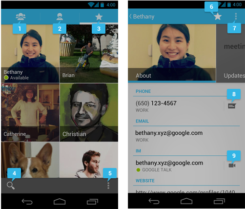
- group
- all contacts
- favorites
- search
- action overflow button
- when starred: remove from favorites when not starred: add to favorties
- action overflow button
- text message
- video chat
Provide alternatives to affordances that time out
Your app may have icons or controls that disappear after a certain amount of time. For example, five seconds after starting a video, playback controls may fade from the screen.
Due to the way that TalkBack works, those controls are not read out loud unless they are focused on. If they fade out from the screen quickly, your user may not even be aware that they are available. Therefore, make sure that you are not relying on timed out controls for high priority task flows. (This is a good universal design guideline too.) If the controls enable an important function, make sure that the user can turn on the controls again and/or their function is duplicated elsewhere. You can also change the behavior of your app when accessibility services are turned on. Your developer may be able to make sure that timed-out controls won't disappear.
Use standard framework controls or enable TalkBack for custom controls
Standard Android framework controls work automatically with accessibility services and have ContentDescriptions built in by default.
An oft-overlooked system control is font size. Users can turn on a system-wide large font size in Settings; using the default system font size in your application will enable the user's preferences in your app as well. To enable system font size in your app, mark text and their associated containers to be measured in scale pixels.
Also, keep in mind that when users have large fonts enabled or speak a different language than you, their type might be larger than the space you've allotted for it. Read Devices and Displays and Supporting Multiple Screens for design strategies.
If you use custom controls, Android has the developer tools in place to allow adherence to the above guidelines and provide meaningful descriptions about the UI. Provide adequate notation on your wireframes and direct your developer to the Custom Views documentation.
Try it out yourself
Turn on the TalkBack service in Settings > Accessibility and navigate your application using directional controls or eyes-free navigation.
Checklist
- Make navigation intuitive
- Use recommended touch target sizes
- Label visual UI elements meaningfully
- Provide alternatives to affordances that time out
- Use standard framework controls or enable TalkBack for custom controls
- Try it out yourself