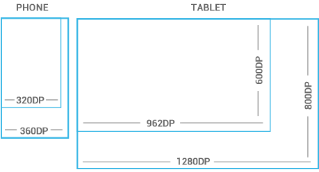
Devices vary not only in physical size, but also in screen density (DPI). To simplify the way you design for multiple screens, think of each device as falling into a particular size bucket and density bucket:
- The size buckets are handset (smaller than 600dp) and tablet (larger than or equal 600dp).
- The density buckets are LDPI, MDPI, HDPI, XHDPI, and XXHDPI.
Optimize your application's UI by designing alternative layouts for some of the different size buckets, and provide alternative bitmap images for different density buckets.
Because it's important that you design and implement your layouts for multiple densities, the guidelines below and throught the documentation refer to layout dimensions with dp measurements instead of pixels.
Space considerations
Devices vary in the amount of density-independent pixels (dp) they can display.
To see more, visit the Screen Sizes and Densities Device Dashboard.
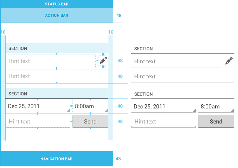
48dp Rhythm
Touchable UI components are generally laid out along 48dp units.

Why 48dp?
On average, 48dp translate to a physical size of about 9mm (with some variability). This is comfortably in the range of recommended target sizes (7-10 mm) for touchscreen objects and users will be able to reliably and accurately target them with their fingers.
If you design your elements to be at least 48dp high and wide you can guarantee that:
- your targets will never be smaller than the minimum recommended target size of 7mm regardless of what screen they are displayed on.
- you strike a good compromise between overall information density on the one hand, and targetability of UI elements on the other.
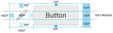
Mind the gaps
Spacing between each UI element is 8dp.
Examples