An icon is a graphic that takes up a small portion of screen real estate and provides a quick, intuitive representation of an action, a status, or an app.
When you design icons for your app, it's important to keep in mind that your app may be installed on a variety of devices that offer a range of pixel densities, as mentioned in Devices and Displays. But you can make your icons look great on all devices by providing each icon in multiple sizes. When your app runs, Android checks the characteristics of the device screen and loads the appropriate density-specific assets for your app.
Because you will deliver each icon in multiple sizes to support different densities, the design guidelines below refer to the icon dimensions in dp units, which are based on the pixel dimensions of a medium-density (MDPI) screen.
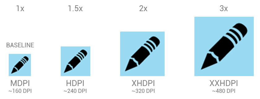
So, to create an icon for different densities, you should follow the 2:3:4:6 scaling ratio between the four primary densities (medium, high, x-high, and xx-high, respectively). For example, consider that the size for a launcher icon is specified to be 48x48 dp. This means the baseline (MDPI) asset is 48x48 px, and the high density (HDPI) asset should be 1.5x the baseline at 72x72 px, and the x-high density (XHDPI) asset should be 2x the baseline at 96x96 px, and so on.
Note: Android also supports low-density (LDPI) screens, but you normally don't need to create custom assets at this size because Android effectively down-scales your HDPI assets by 1/2 to match the expected size.
Launcher
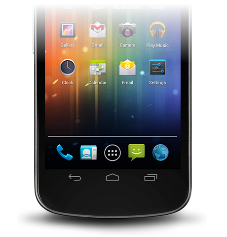
The launcher icon is the visual representation of your app on the Home or All Apps screen. Since the user can change the Home screen's wallpaper, make sure that your launcher icon is clearly visible on any type of background.

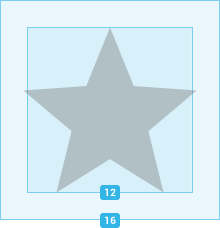
Sizes & scale
Proportions
Style
Use a distinct silhouette. Three-dimensional, front view, with a slight perspective as if viewed from above, so that users perceive some depth.
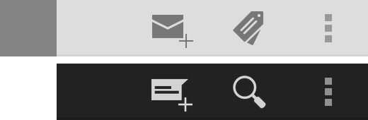
Action Bar
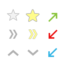
Action bar icons are graphic buttons that represent the most important actions people can take within your app. Each one should employ a simple metaphor representing a single concept that most people can grasp at a glance.
Pre-defined glyphs should be used for certain common actions such as "refresh" and "share." The download link below provides a package with icons that are scaled for various screen densities and are suitable for use with the Holo Light and Holo Dark themes. The package also includes unstyled icons that you can modify to match your theme, in addition to Adobe® Illustrator® source files for further customization.
Download the Action Bar Icon Pack


Sizes & scale
Focal area & proportions
Style
Pictographic, flat, not too detailed, with smooth curves or sharp shapes. If the graphic is thin, rotate it 45° left or right to fill the focal space. The thickness of the strokes and negative spaces should be a minimum of 2 dp.
Colors
Colors: #333333
Enabled: 60% opacity
Disabled: 30% opacity
Colors: #FFFFFF
Enabled: 80% opacity
Disabled: 30% opacity
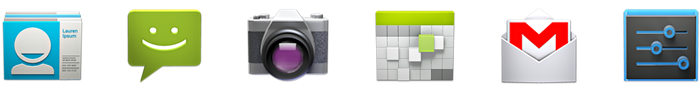
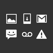
Small / Contextual Icons
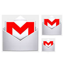
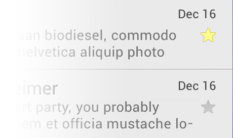
Within the body of your app, use small icons to surface actions and/or provide status for specific items. For example, in the Gmail app, each message has a star icon that marks the message as important.

Sizes & scale
Focal area & proportions
Style
Neutral, flat, and simple. Filled shapes are easier to see than thin strokes. Use a single visual metaphor so that a user can easily recognize and understand its purpose.
Colors
Use non-neutral colors sparingly and with purpose. For example, Gmail uses yellow in the star icon to indicate a bookmarked message. If an icon is actionable, choose a color that contrasts well with the background.
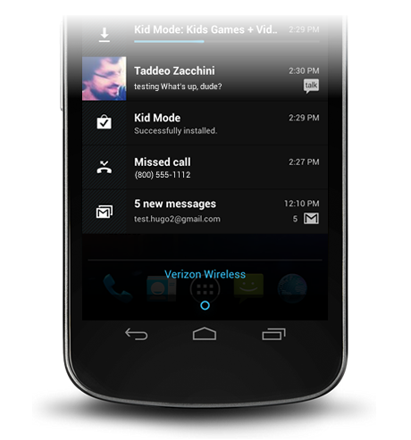
Notification Icons
If your app generates notifications, provide an icon that the system can display in the status bar whenever a new notification is available.

Sizes & scale
Focal area & proportions
Style
Keep the style flat and simple, using the same single, visual metaphor as your launcher icon.
Colors
Notification icons must be entirely white. Also, the system may scale down and/or darken the icons.
Design Tips
Here are some tips you might find useful as you create icons or other drawable assets for your application. These tips assume you are using Adobe® Photoshop® or a similar raster and vector image-editing program.
Use vector shapes where possible
Many image-editing programs such as Adobe® Photoshop® allow you to use a combination of vector shapes and raster layers and effects. When possible, use vector shapes so that if the need arises, assets can be scaled up without loss of detail and edge crispness.
Using vectors also makes it easy to align edges and corners to pixel boundaries at smaller resolutions.
Start with large artboards
Because you will need to create assets for different screen densities, it is best to start your icon designs on large artboards with dimensions that are multiples of the target icon sizes. For example, launcher icons are 48, 72, 96, or 144 pixels wide, depending on screen density (mdpi, hdpi, xhdpi, and xxhdpi, respectively). If you initially draw launcher icons on an 864x864 artboard, it will be easier and cleaner to adjust the icons when you scale the artboard down to the target sizes for final asset creation.
When scaling, redraw bitmap layers as needed
If you scaled an image up from a bitmap layer, rather than from a vector layer, those layers will need to be redrawn manually to appear crisp at higher densities. For example if a 60x60 circle was painted as a bitmap for mdpi it will need to be repainted as a 90x90 circle for hdpi.
Use common naming conventions for icon assets
Try to name files so that related assets will group together inside a directory when they are sorted alphabetically. In particular, it helps to use a common prefix for each icon type. For example:
| Asset Type | Prefix | Example |
|---|---|---|
| Icons | ic_ |
ic_star.png |
| Launcher icons | ic_launcher |
ic_launcher_calendar.png |
| Menu icons and Action Bar icons | ic_menu |
ic_menu_archive.png |
| Status bar icons | ic_stat_notify |
ic_stat_notify_msg.png |
| Tab icons | ic_tab |
ic_tab_recent.png |
| Dialog icons | ic_dialog |
ic_dialog_info.png |
Note that you are not required to use a shared prefix of any type—doing so is for your convenience only.
Set up a working space that organizes files by density
Supporting multiple screen densities means you must create multiple versions of the same icon. To help keep the multiple copies of files safe and easier to find, we recommend creating a directory structure in your working space that organizes asset files based on the target density. For example:
art/...
    mdpi/...
        _pre_production/...
            working_file.psd
        finished_asset.png
    hdpi/...
        _pre_production/...
            working_file.psd
        finished_asset.png
    xhdpi/...
        _pre_production/...
            working_file.psd
        finished_asset.png
xxhdpi/...
_pre_production/...
working_file.psd
finished_asset.png
Because the structure in your working space is similar to that of the application, you can quickly determine which assets should be copied to each resources directory. Separating assets by density also helps you detect any variances in filenames across densities, which is important because corresponding assets for different densities must share the same filename.
For comparison, here's the resources directory structure of a typical application:
res/...
    drawable-ldpi/...
        finished_asset.png
    drawable-mdpi/...
        finished_asset.png
    drawable-hdpi/...
        finished_asset.png
    drawable-xhdpi/...
        finished_asset.png
For more information about how to save resources in the application project, see Providing Resources.
Remove unnecessary metadata from final assets
Although the Android SDK tools will automatically compress PNGs when packaging application resources into the application binary, a good practice is to remove unnecessary headers and metadata from your PNG assets. Tools such as OptiPNG or Pngcrush can ensure that this metadata is removed and that your image asset file sizes are optimized.