Developer Docs
Notifying the User
The notification system allows your app to keep the user informed about events, such as new chat messages or a calendar event. Think of notifications as a news channel that alerts the user to important events as they happen or a log that chronicles events while the user is not paying attention.
New in Jelly Bean
In Jelly Bean, notifications received their most important structural and functional update since the beginning of Android.
- Notifications can include actions that enable the user to immediately act on a notification from the notification drawer.
- Notifications are now more flexible in size and layout. They can be expanded to show additional information details.
- A priority flag was introduced that helps to sort notifications by importance rather than time only.
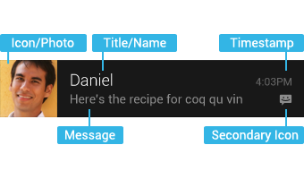
Anatomy of a notification
Base Layout
At a minimum, all notifications consist of a base layout, including:
- the sending application's notification icon or the sender's photo
- a notification title and message
- a timestamp
- a secondary icon to identify the sending application when the senders image is shown for the main icon
The information arrangement of the base layout has not changed in Jelly Bean, so app notifications designed for versions earlier than Jelly Bean still look and work the same.
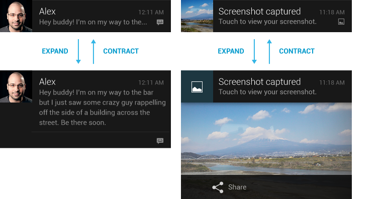
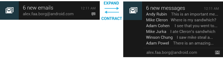
Expanded layouts
With Jelly Bean you have the option to provide more event detail. You can use this to show the first few lines of a message or show a larger image preview. This provides the user with additional context, and - in some cases - may allow the user to read a message in its entirety. The user can pinch-zoom or two-finger glide in order to toggle between base and expanded layouts. For single event notifications, Android provides two expanded layout templates (text and image) for you to re-use in your application.
Actions
Starting with Jelly Bean, Android supports optional actions that are displayed at the bottom of the notification. With actions, users can handle the most common tasks for a particular notification from within the notification shade without having to open the originating application. This speeds up interaction and, in conjunction with "swipe-to-dismiss", helps users to streamline their notification triaging experience.
Be judicious with how many actions you include with a notification. The more actions you include, the more cognitive complexity you create. Limit yourself to the fewest number of actions possible by only including the most imminently important and meaningful ones.
Good candidates for actions on notifications are actions that are:
- essential, frequent and typical for the content type you're displaying
- time-critical
- not overlapping with neighboring actions
Avoid actions that are:
- ambiguous
- duplicative of the default action of the notification (such as "Read" or "Open")
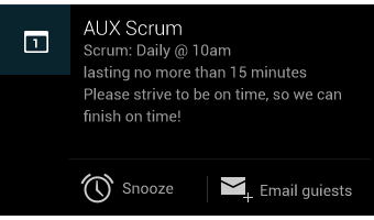
You can specify a maximum of three actions, each consisting of an action icon and an action name. Adding actions to a simple base layout will make the notification expandable, even if the notification doesn't have an expanded layout. Since actions are only shown for expanded notifications and are otherwise hidden, you must make sure that any action a user can invoke from a notification is available from within the associated application as well.
Design guidelines
Make it personal
For notifications of items sent by another user (such as a message or status update), include that person's image.
Remember to include the app icon as a secondary icon in the notification, so that the user can still identify which app posted it.
Navigate to the right place
When the user touches the body of a notification (outside of the action buttons), open your app to the place where the user can consume and act upon the data referenced in the notification. In most cases this will be the detail view of a single data item such as a message, but it might also be a summary view if the notification is stacked (see Stacked notifications below) and references multiple items. If in any of those cases the user is taken to a hierarchy level below your app's top-level, insert navigation into your app's back stack to allow them to navigate to your app's top level using the system back key. For more information, see the chapter on System-to-app navigation in the Navigation design pattern.
Correctly set and manage notification priority
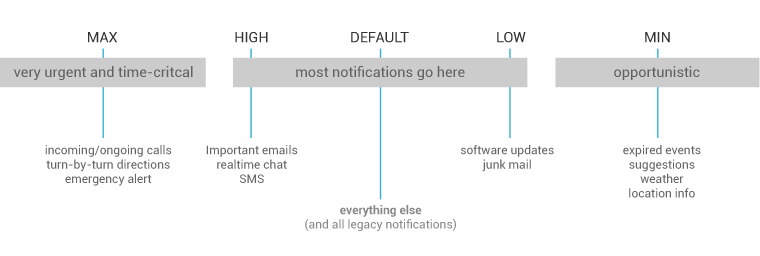
Starting with Jelly Bean, Android now supports a priority flag for notifications. It allows you to influence where your notification will appear in comparison to other notifications and help to make sure that users always see their most important notifications first. You can choose from the following priority levels when posting a notification:
| Priority | Use |
|---|---|
| MAX | Use for critical and urgent notifications that alert the user to a condition that is time-critical or needs to be resolved before they can continue with a particular task. |
| HIGH | Use high priority notifications primarily for important communication, such as message or chat events with content that is particularly interesting for the user. |
| DEFAULT | The default priority. Keep all notifications that don't fall into any of the other categories at this priority level. |
| LOW | Use for notifications that you still want the user to be informed about, but that rate low in urgency. |
| MIN | Contextual/background information (e.g. weather information, contextual location information). Minimum priority notifications will not show in the status bar. The user will only discover them when they expand the notification tray. |
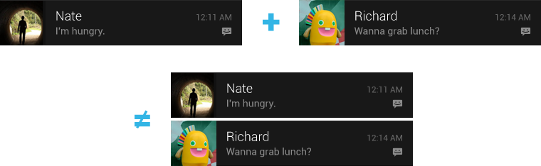
Stack your notifications
If your app creates a notification while another of the same type is still pending, avoid creating an altogether new notification object. Instead, stack the notification.
A stacked notification builds a summary description and allows the user to understand how many notifications of a particular kind are pending.
Don't:
Do:
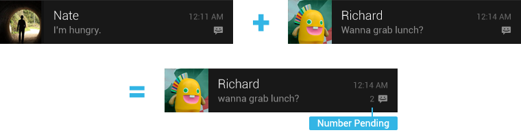
You can provide more detail about the individual notifications that make up a stack by using the expanded digest layout. This allows users to gain a better sense of which notifications are pending and if they are interesting enough to be read in detail within the associated app.
Make notifications optional
Users should always be in control of notifications. Allow the user to disable your apps notifications or change their alert properties, such as alert sound and whether to use vibration, by adding a notification settings item to your application settings.
Use distinct icons
By glancing at the notification area, the user should be able to discern what kinds of notifications are currently pending.
Look at the notification icons the Android apps already provide and create notification icons for your app that are sufficiently distinct in appearance.
Use the proper notification icon style for small icons, and the Holo Dark action bar icon style for your action icons.
Keep your icons visually simple and avoid excessive detail that is hard to discern.
Use color to distinguish your app from others.
Pulse the notification LED appropriately
Many Android devices contain a tiny lamp, called the notification LED, which is used to keep the user informed about events while the screen is off. Notifications with a priority level of MAX, HIGH, or DEFAULT should cause the LED to glow, while those with lower priority (LOW and MIN) should not.
The user's control over notifications should extend to the LED. By default, the LED will glow with a white color. Your notifications shouldn't use a different color unless the user has explicitly customized it.
Building notifications that users care about
To create an app that feels streamlined, pleasant, and respectful, it is important to design your notifications carefully. Notifications embody your app's voice, and contribute to your app's personality. Unwanted or unimportant notifications can annoy the user, so use them judiciously.
When to display a notification
To create an application that people love, it's important to recognize that the user's attention and focus is a resource that must be protected. While Android's notification system has been designed to minimize the impact of notifications on the users attention, it is nonetheless still important to be aware of the fact that notifications are potentially interrupting the users task flow. As you plan your notifications, ask yourself if they are important enough to warrant an interruption. If you are unsure, allow the user to opt into a notification using your apps notification settings or adjust the notifications priority flag.
While well behaved apps generally only speak when spoken to, there are some limited cases where an app actually should interrupt the user with an unprompted notification.
Notifications should be used primarily for time sensitive events, and especially if these synchronous events involve other people. For instance, an incoming chat is a real time and synchronous form of communication: there is another user actively waiting on you to respond. Calendar events are another good example of when to use a notification and grab the user's attention, because the event is imminent, and calendar events often involve other people.

When not to display a notification
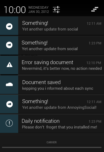
There are however many other cases where notifications should not be used:
-
Avoid notifying the user of information that is not directed specifically at them, or information that is not truly time sensitive. For instance the asynchronous and undirected updates flowing through a social network generally do not warrant a real time interruption. For the users that do care about them, allow them to opt-in.
-
Don't create a notification if the relevant new information is currently on screen. Instead, use the UI of the application itself to notify the user of new information directly in context. For instance, a chat application should not create system notifications while the user is actively chatting with another user.
-
Don't interrupt the user for low level technical operations, like saving or syncing information, or updating an application, if it is possible for the system to simply take care of itself without involving the user.
-
Don't interrupt the user to inform them of an error if it is possible for the application to quickly recover from the error on its own without the user taking any action.
-
Don't create notifications that have no true notification content and merely advertise your app. A notification should inform the user about a state and should not be used to merely launch an app.
-
Don't create superfluous notifications just to get your brand in front of users. Such notifications will only frustrate and likely alienate your audience. The best way to provide the user with a small amount of updated information and to keep them engaged with your application is to develop a widget that they can choose to place on their home screen.
Interacting With Notifications
Notifications are indicated by icons in the notification area and can be accessed by opening the notification drawer.
Inside the drawer, notifications are chronologically sorted with the latest one on top. Touching a notification opens the associated app to detailed content matching the notification. Swiping left or right on a notification removes it from the drawer.
On tablets, the notification area is integrated with the system bar at the bottom of the screen. The notification drawer is opened by touching anywhere inside the notification area.
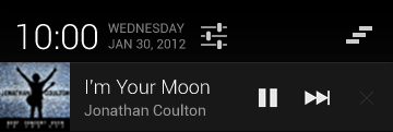
Ongoing notifications
Ongoing notifications keep users informed about an ongoing process in the background. For example, music players announce the currently playing track in the notification system and continue to do so until the user stops the playback. They can also be used to show the user feedback for longer tasks like downloading a file, or encoding a video. Ongoing notifications cannot be manually removed from the notification drawer.
Dialogs and toasts are for feedback not notification
Your app should not create a dialog or toast if it is not currently on screen. Dialogs and Toasts should only be displayed as the immediate response to the user taking an action inside of your app. For further guidance on the use of dialogs and toasts, refer to Confirming & Acknowledging.